
What is covered, week by week, and which topics each lecture draws on.
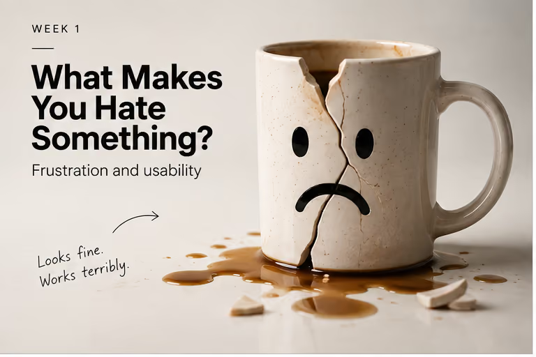
A ceramic mug cracked into a frowning face, leaking coffee onto the counter, next to the note "Looks fine. Works terribly."

What Makes You Hate Something?

The opening lecture — why looking ugly and working badly are two different problems, and which one this course spends the semester on

Week 1 · 22 February 2027
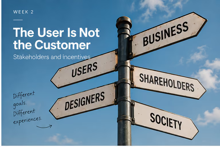
A crossroads signpost with arrows pointing to Business, Users, Shareholders, Designers and Society, next to the note "Different goals. Different experiences."

The User Is Not the Customer

Why a system can work great for whoever pays for it and badly for whoever is stuck using it — and why "bad design" always has to name who it's bad for

Week 2 · 1 March 2027
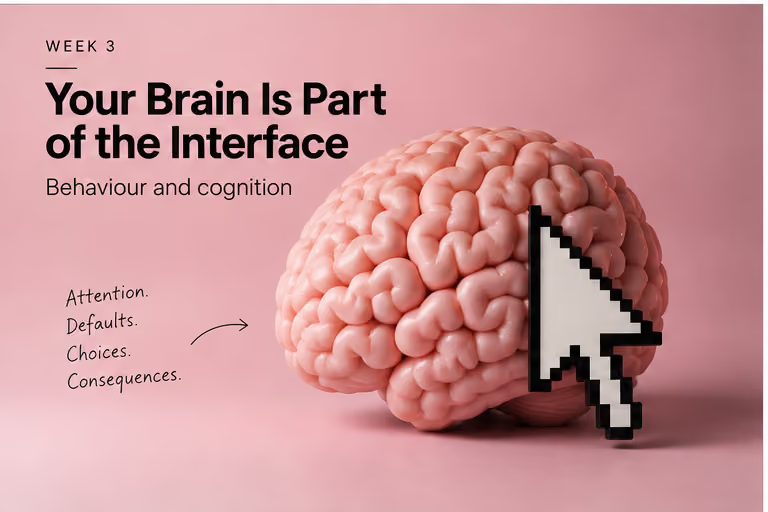
A large pink model brain with a pixelated cursor arrow pressed into its side, next to the note "Attention. Defaults. Choices. Consequences."

Your Brain Is Part of the Interface

How defaults, fake scarcity and social proof quietly steer decisions you thought you made yourself

Week 3 · 8 March 2027
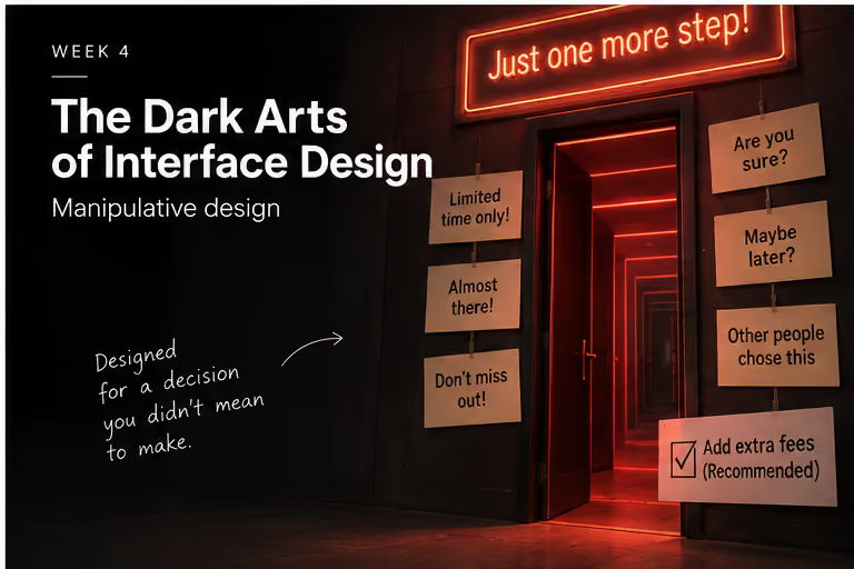
A glowing red corridor of doors under a neon sign reading "Just one more step!", flanked by sticky notes reading "Are you sure?", "Maybe later?" and a pre-checked "Add extra fees (Recommended)."

The Dark Arts of Interface Design

The dark patterns get names so you can spot them — but naming one is the easy part, not the useful part

Week 4 · 15 March 2027
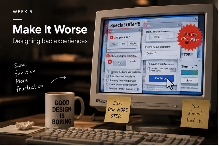
An old CRT monitor cluttered with overlapping pop-ups and a "Continue" button, beside a mug reading "Good design is boring" and sticky notes reading "Just one more step..." and "You almost had it!"

Make It Worse

Your first build: taking something that works and making it deliberately, specifically worse

Week 5 · 22 March 2027
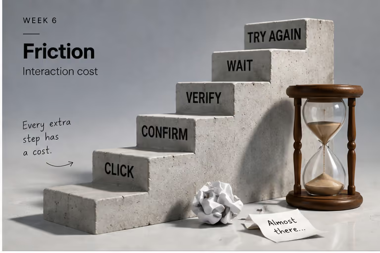
A staircase of concrete steps labelled Click, Confirm, Verify, Wait and Try Again, leading up to an hourglass, next to the note "Every extra step has a cost."

Friction

Not all friction is the same — some of it protects you, some is an accident, and some is there on purpose

Week 6 · 29 March 2027
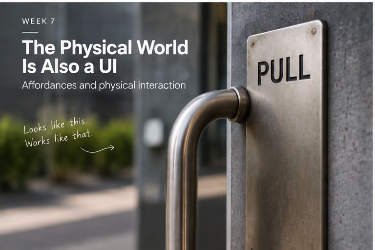
A door handle plate labelled "PULL" on a door that has to be pushed, next to the note "Looks like this. Works like that."

The Physical World Is Also a UI

Doors, chairs and vending machines have interfaces too, and they can lie to you the same way a checkout button can

Week 7 · 19 April 2027
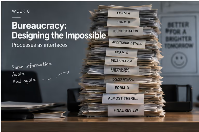
A precarious stack of forms labelled Form A, Identification, Additional Details, Declaration and Final Review, next to the note "Same information. Again. And again."

Bureaucracy: Designing the Impossible

Sometimes the worst interface isn't a screen at all — it's a form, a queue, and a rule nobody can explain

Week 8 · 26 April 2027
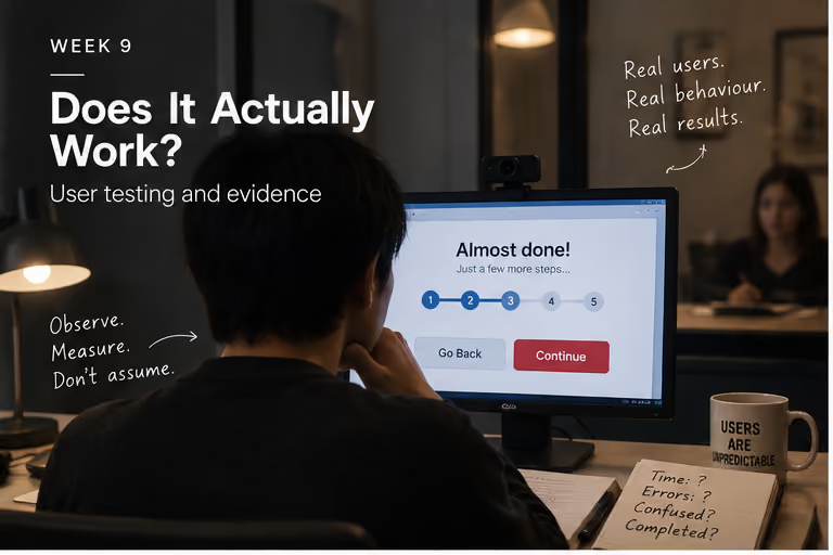
A person watching a stranger struggle through an "Almost done!" checkout flow, next to a mug reading "Users are unpredictable" and the note "Observe. Measure. Don't assume."

Does It Actually Work?

Testing whether the frustrating design you built on paper is actually frustrating once a real person tries it

Week 9 · 3 May 2027
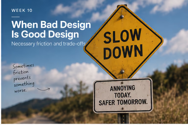
A yellow "SLOW DOWN" road sign above a smaller sign reading "Annoying today. Safer tomorrow.", next to the note "Sometimes friction prevents something worse."

Is Bad Design Actually Bad?

Some of the bad design you've spent nine weeks mocking turns out to be doing its job on purpose — and now you have to defend it

Week 10 · 10 May 2027
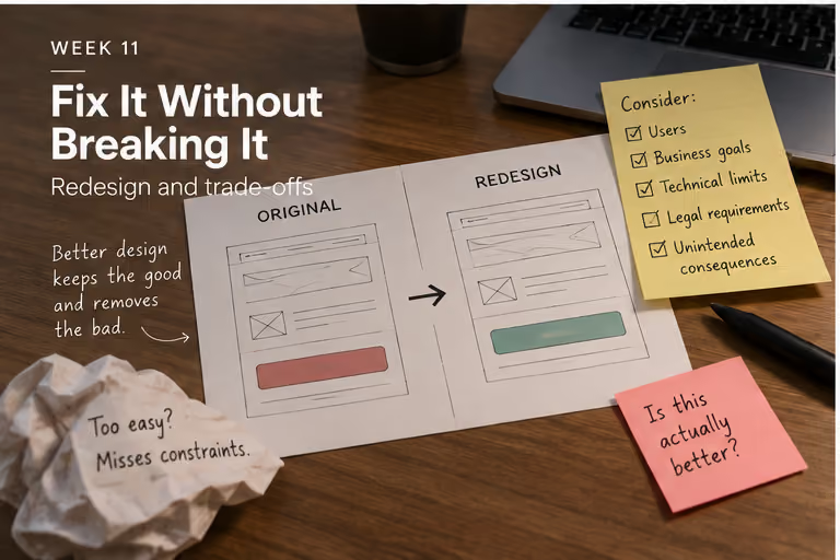
A wireframe sketch of an original screen redesigned into a better one, surrounded by sticky notes checklisting users, business goals, technical limits and legal requirements, next to the note "Better design keeps the good and removes the bad."

Fix It Without Breaking It

Redesigning a hostile system without pretending its original goals didn't exist

Week 11 · 17 May 2027
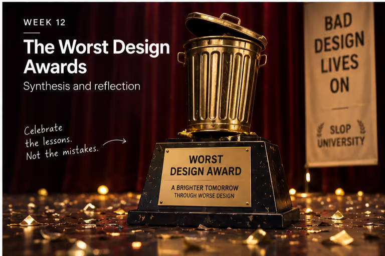
A trophy shaped like a golden bin on a stage, engraved "Worst Design Award — a brighter tomorrow through worse design", next to the note "Celebrate the lessons. Not the mistakes."

The Worst Design Awards

The same question the course opened with, asked one more time now that you actually know how to answer it

Week 12 · 24 May 2027