Week 4: The Dark Arts of Interface Design
The dark patterns get names so you can spot them — but naming one is the easy part, not the useful part
15 March 2027
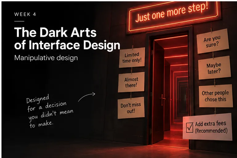
Dark patterns have names because names travel: confirmshaming, forced continuity, bait-and-switch, trick questions, disguised advertisements, difficult cancellation, privacy manipulation, sneaking items into a basket. The names are not the point of this week. The point is that every one of them is trying to produce a specific behaviour, and the interesting question is never “what is this pattern called” but “what would the user do without it, and what exactly changes that.”
Every one of these techniques is last week’s material wearing a name. “No thanks, I don’t want to save money” is loss aversion and framing doing exactly what you’d predict; a pre-checked extra at checkout is a default doing its job. Naming the pattern is just the first step of noticing that the mechanism was there all along.
Outline#
- confirmshaming, hidden costs, forced continuity, bait-and-switch, trick questions, disguised advertisements, difficult cancellation, privacy manipulation, basket sneaking
- why “no thanks, I don’t want to save money” is week 3’s framing, not a new trick
- why the pattern’s name matters less than the behaviour it produces
- Dark Pattern Detective, this week’s session
- next week: applying this deliberately, for the first time
Teaching team
- Marisol Quaye — convenor