Week 1: What Makes You Hate Something?
The opening lecture — why looking ugly and working badly are two different problems, and which one this course spends the semester on
22 February 2027
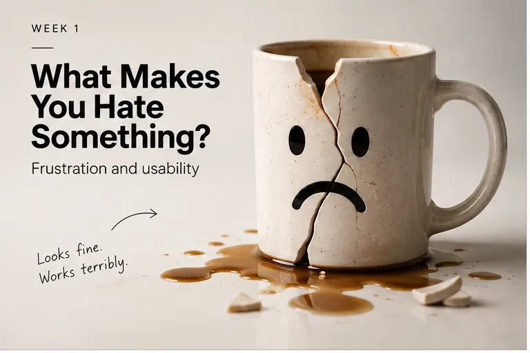
Designing Things People Hate starts from a deliberately provocative title and a much less provocative question: if good design makes people’s lives easier, what makes bad design so effective at making them worse? The instinct is to answer with aesthetics — ugly buttons, garish colour, confusing icons — and this course spends its first three weeks talking students out of that instinct. A truly effective bad design is often popular, functional, even good-looking; it’s bad because of what it makes you do, not how it looks doing it.
Most of what makes something genuinely bad to use comes down to a handful of ordinary ideas, not a design vocabulary you need to learn first: whether it does what you expected, whether you could tell what your options even were, whether it told you anything happened when you pressed the button, and whether a mistake was easy to make and hard to undo. You already know the feeling of pressing something twice because nothing seemed to happen the first time — that’s the whole course, before it has a name for itself.
Outline#
- why the course’s real subject is behaviour, not appearance
- expectations, discoverability, feedback and errors — the four ordinary ways something fails you before you’ve even started
- Notice → Explain → Manipulate → Break → Measure → Design → Defend → Redesign — the shape of the whole semester
- what the Hate Wall does with today’s submissions, and how it becomes the Hate Catalogue
- what to have ready before the first session
Teaching team
- Marisol Quaye — convenor