Week 7: From acronym to sentence: text on the dashboard
What a full sentence can tell a driver that an icon and a two-letter code never could, and the translation bill that arrives the moment the dashboard starts writing in words
5 April 2027
Last week the dashboard spoke in chimes; this week it starts writing full
sentences. For most of the instrument cluster’s history, text on the dash was
rationed to the smallest unit that would fit on a seven-segment or dot-matrix
display: three letters, sometimes four. A driver who saw SVS or ESP OFF
light up was handed a code, not a message, and the actual meaning lived in the
owner’s manual, in a glovebox, several kilometres away from the moment they
needed it. The multi-information display changed the economics of that
exchange: once the cluster had a real screen instead of a segmented readout,
the car could simply say what it meant. The guiding question this week is
what a sentence buys over an icon or an acronym, and what it costs to buy it.
A sentence removes ambiguity an icon cannot#
An icon is a hypothesis about what the driver will infer, compressed into a shape small enough to read in peripheral vision. That compression is the source of its speed and the source of its failure mode: a thermometer icon over a dashed line means “check coolant temperature,” but only if the driver has already learned that convention, and it means nothing at all to a driver encountering it for the first time under stress. A sentence closes that gap by construction. “Low tyre pressure — check tyres” cannot be misread as an engine problem, cannot be confused with a different icon on a cluttered cluster, and requires no prior training. Where an icon asks the driver to supply the missing verb, a sentence supplies it for them.
What a sentence costs that a glance doesn’t#
The price is time. An icon is processed by peripheral, largely pre-attentive vision in a fraction of a second; a sentence requires foveal vision — the eye has to fixate on the text, and reading is serial, word by word. Human-factors research on in-vehicle displays consistently finds that reading even a short message off-road-centre measurably increases eyes-off-road time relative to recognising a symbol, which is exactly the resource a driver has least of when something is actually wrong. Comprehension accuracy and reading time trade against each other: the more precisely a message specifies the fault, the longer the sentence, and the longer the sentence, the longer the driver’s eyes are off the road to receive it.
Case study: the acronym, the sentence, and the language it’s written in#
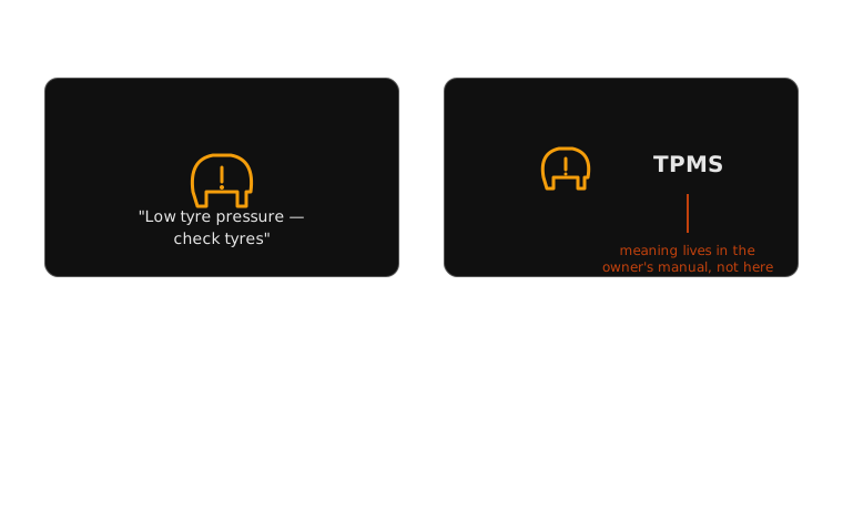
Take a single fault — a tyre-pressure-monitoring alert. The older pattern
pairs a warning icon with a code the driver has to look up, or with an
acronym like TPMS that means nothing without prior exposure. The newer
pattern, on a multi-information display, spells it out: “Low tyre pressure —
check tyres,” sometimes naming the specific wheel. This is a genuine
improvement in comprehension. But it introduces a problem the icon never
had. A pictogram of a tyre cross-section with an exclamation mark, per ISO
2575, means the same thing whether the car is sold in Munich, Osaka or
São Paulo — it ships once. A sentence has to be translated into every market
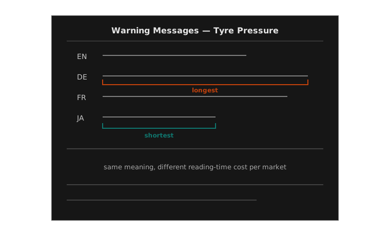
language the vehicle is sold in, and translated well: “check tyres” rendered
too literally, or by a contractor without automotive-domain context, can read
as vague, alarming, or simply wrong in the target language, in ways a
universal pictogram is structurally immune to. Text buys precision and
spends localisation — a cost line that scales with every market the
manufacturer enters, and one that a badly-funded localisation pass can turn
into a new source of the exact ambiguity the sentence was supposed to remove.
Plain-language text, read against the six-question framework introduced in week 1: urgency the sentence can state directly rather than implying (“check tyres” versus a bare icon); foveal, not peripheral, visibility — a driver has to look at and read it, which an icon doesn’t require; meaning that needs no prior convention, unlike an icon; textual modality, the slowest of the channels this course has covered so far; timing typically persistent until the fault clears; and a required action the sentence can name explicitly (“check tyres”) where an icon could only gesture at a category. The trade a sentence makes for that precision is the one thing the framework doesn’t price on its own: translation, which is why this week’s case study spent as long on the manual page as on the dashboard.
Next week the dashboard moves again — off the instrument cluster and onto the windscreen itself, where a heads-up display puts text and icons directly in the driver’s line of sight instead of asking them to look down for either. Assessment 2, “Redesign a Warning,” is due at the end of that week.
Teaching team
- Marisol Quaye — convenor