Week 7
From acronym to sentence: text on the dashboard
What can a sentence say that an icon can’t, and what does it cost to say it?
Learning objectives
By the end of this week you should be able to:
- identify an acronym-and-icon telltale versus a plain-language multi-information display message for the same underlying fault
- explain why reading a sentence costs more driver attention than recognising an icon, in terms of foveal versus peripheral vision
- compare icon-only, icon-plus-acronym and full-sentence messages across reading time, ambiguity and translation cost
- describe the localisation problem a text message introduces that a pictogram is structurally immune to
- propose a synthesis design (e.g. icon-plus-short-text) and state which problem it solves and which it doesn’t
Opening example: the light that used to send you to the manual
A driver in 2004 sees a small tyre-pressure icon light up on the cluster,
next to the letters TPMS. Nothing else. To find out what that means, they
either already know the acronym, or they pull over and open the glovebox.
A driver in the same car’s 2024 equivalent sees, on the multi-information display between the gauges: “Low tyre pressure — check tyres.” No lookup required. The message is the meaning.
Why this example carries the week
Both drivers received the same underlying signal — a pressure sensor
crossing a threshold. The car’s engineering didn’t change; its language
did. The 2024 driver spent longer with their eyes on the display to read
eight words than the 2004 driver spent recognising one icon shape — but the
2004 driver, unless they already knew TPMS, learned nothing actionable at
all in that glance. This is the trade the whole week is about: a sentence
can’t be ambiguous the way an icon can, but it can’t be free the way an icon
almost is, either.
An icon is a compressed hypothesis
An icon is a bet: that the driver has already learned, somewhere else, what this shape means. A thermometer over a wavy line is a bet that “coolant temperature” is already wired into the driver’s head. When the bet pays off, recognition is close to instant and happens in peripheral vision, before the driver has consciously “read” anything. When the bet doesn’t pay off — a new driver, a rental car, an unfamiliar model — the icon delivers nothing. It fails silently. The driver doesn’t know they’ve missed the message; they just see a shape they don’t recognise and move on.
A sentence collects on every bet at once
A sentence doesn’t ask the driver to have learned anything in advance. “Low tyre pressure — check tyres” means what it says, to a first-time driver in a rental car exactly as well as to the vehicle’s owner of ten years. That is the entire value proposition of text on a dashboard: it trades a probabilistic recognition event for a guaranteed comprehension event, provided the driver can read the language it’s written in — a proviso an icon never needs.
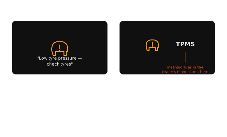
Same fault, two eras of dashboard language: a code to look up, or a sentence to read.
The cost: foveal vision is slow and serial
Peripheral vision resolves shape and colour fast, in parallel, without requiring the eye to fixate on anything. Reading text requires foveal vision — the eye has to physically point at the words, and it processes them one at a time, left to right (or right to left, depending on the locale). In-vehicle human-factors studies on glance behaviour consistently find that reading a short in-cluster message measurably increases eyes-off- road time compared with recognising a symbol conveying the same underlying alert. For a driver, eyes-off-road time is the resource in shortest supply exactly when a warning is worth reading at all.
Putting a number on the glance
NHTSA’s visual-manual distraction guidelines for in-vehicle interfaces set concrete thresholds precisely because glance time is measurable and dangerous past a point: a single glance should stay at or under about two seconds, with total eyes-off-road time for one task capped at around twelve seconds. Recognising an icon typically clears that bar without even approaching it. A multi-clause sentence, especially one requiring a second glance to finish reading, can approach or cross it — which is exactly why manufacturers converge on short, single-clause MID messages rather than paragraph-length explanations, no matter how much more precise a longer message could be.
Two variables in tension, not one design goal
It’s tempting to treat “make the message clearer” as a single objective. It isn’t — clarity and reading time pull against each other:
- Comprehension accuracy rises as a message gets more specific: naming the fault, the affected system, the recommended action
- Reading time rises with every word added to reach that specificity
A designer choosing between TPMS and “Low tyre pressure in the front left
tyre — check and inflate to the recommended pressure shown in the door
sill” is choosing a point on that curve, not a right answer. The
multi-information display convention that won out — short, plain,
one-clause sentences — is a deliberate compromise point, not the ceiling of
what text could say.
Real example: BMW Check Control, text before it was fashionable
BMW’s Check Control system, introduced on the E32 7 Series in 1986, is worth knowing because it is one of the earliest production systems to commit to full written messages instead of expanding the icon set: instead of adding more telltales for more faults, it added a small text display and a voice module that could say things like “brake pads worn” or “engine oil level low” outright. It matters for this week because it shows the acronym- to-sentence shift isn’t a 2020s multi-information-display phenomenon at all — the trade-off has been live, and being actively designed around, for close to forty years.
Real example: Volvo’s messages that explain a judgement, not just a fault
Volvo’s driver-support messages (in Sensus and its successors) are useful here because several of them aren’t reporting a mechanical fault at all — they’re narrating an assessment. A driver-fatigue message reads along the lines of “You seem tired. Consider taking a break,” recommending a coffee cup icon and a rest-stop suggestion. No icon vocabulary could carry that content: there’s no pictogram for “the car’s inference about your alertness level,” only a sentence can. This previews a problem week 9 returns to directly — messages that have to explain a car’s decision, not just a sensor reading.
Real example: the hybrid middle ground — Audi’s virtual cockpit
Audi’s digital instrument cluster (and comparable systems from Volkswagen) is a useful counter-example because it doesn’t choose fully between icon and sentence — it pairs a small icon with a short text label underneath it, simultaneously, on the same display. “Low tyre pressure” appears as text directly beside the tyre icon, rather than replacing it. This is the synthesis the case study below argues for: keep the icon’s near-instant peripheral recognition, and let the short text resolve exactly the ambiguity the icon alone couldn’t.
Real example: the same manufacturer, forty years apart
Mercedes-Benz is a useful bookend because you can watch the whole shift happen inside one badge. A 1985 W124-generation cluster communicates almost entirely through icon telltales and a handful of analogue gauges — no message strings at all, by design; the electronics of the era simply had nowhere to put one. The 2021 MBUX Hyperscreen cluster from week 1 communicates the same categories of fault as full plain-language notifications, rendered on a screen that didn’t exist as a dashboard component when the W124 was drawn. The fault categories barely changed in forty years — low oil pressure is still low oil pressure. What changed was entirely the display technology’s capacity to render a sentence at all.
The process: how a fault becomes a sentence you read
- Fault detected — a sensor crosses a threshold (tyre pressure, coolant temperature, brake-pad wear)
- Message selected — the system looks up the fault code in a localisation table keyed to the vehicle’s set market/language
- String rendered — the matching sentence is drawn from that table and displayed in the driver’s configured locale
- Driver reads and comprehends — a step an icon skips entirely; this is where foveal, serial reading happens
- Driver acts — pulls over, checks tyres, books a service
Where the reading-time cost actually lands
| Stage | Icon-only path | Sentence path |
|---|---|---|
| 1–2 (detect, select) | identical | identical |
| 3 (render) | render one shape | render and lay out a full string, sized to fit the panel |
| 4 (comprehend) | pre-attentive, sub-second | foveal, serial — hundreds of milliseconds per word |
| 5 (act) | identical, if step 4 succeeded | identical |
The two paths are identical everywhere except step 4 — and step 4 is exactly where the icon path can fail silently (unrecognised shape) while the sentence path succeeds slowly. Neither failure mode is free; they’re just different currencies.
Case study, part 1: the original — icon plus acronym
Across the industry after tyre-pressure monitoring became a mandated
feature (following the US TREAD Act, and comparable EU rules from 2014),
the near-universal cluster convention was a small warning icon plus an
acronym — TPMS, or a manufacturer-specific code. Design intent: fit
the alert into a seven-segment or single-icon budget that predates any
real onboard screen; keep the message language-neutral by never using
words at all. Strength: ships identically to every market, no
translation required, ever. Weakness: the acronym itself is not
self-explanatory — a driver has to have already learned it, from a manual
they may have never opened.
Case study, part 2: the sentence — plain language on the MID
Once vehicles carried an actual multi-information display, manufacturers began replacing the acronym with a full clause: “Low tyre pressure — check tyres,” sometimes naming the specific wheel position. Strength: immediately comprehensible to a first-time driver, no prior exposure to any code required. Weakness: costs more reading time than the icon it replaced, and — the problem this case study exists to introduce — every one of those sentences now has to be written, and rewritten, in every language the vehicle is sold in.
Case study, part 3: the bill that arrives with the sentence
A pictogram means the same thing in Munich, Osaka and São Paulo without anyone touching it twice — ISO 2575 exists precisely so that a tyre-cross- section-plus-exclamation-mark icon never needs a translator. A sentence has no such immunity. “Check tyres,” translated too literally or by a contractor without automotive-domain context, can come out vague, overly alarming, or simply wrong in the target language — a mistranslated message can introduce new ambiguity in exactly the spot the sentence was supposed to remove it. That is a real, ongoing cost line for every market a manufacturer enters, one an icon-only system never had to budget for at all. Suggested synthesis: pair the icon with a short, tightly-controlled text string (Audi’s virtual-cockpit pattern) — the icon still recognises instantly and language-neutrally, and the text only has to disambiguate, not carry the whole message alone, which shrinks the translation surface without giving up its benefit.
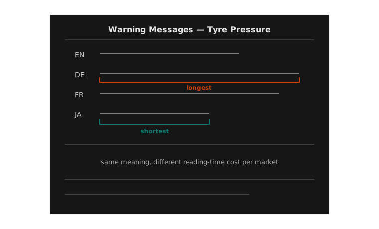
The pictogram above this table didn’t need this page. The sentence did.
Comparison: three designs, one fault
| Dimension | Icon only | Icon + acronym | Full sentence (MID) |
|---|---|---|---|
| Reading time | near-zero (pre-attentive) | low, if code is known | higher — full clause, foveal reading |
| Ambiguity if unfamiliar | high — meaning entirely lost | high — code is opaque without lookup | low — self-explanatory |
| Translation cost | none | none (codes stay in Latin letters) | recurring, per market, per model year |
| Failure mode | silent miss | silent miss, or wrong lookup | slow read, or mistranslation |
No row in this table is free. The industry’s actual trajectory — icon, to icon-plus-acronym, to full sentence, to icon-plus-short-text — reads as a slow search for the least-bad point on this table, not a discovery of a perfect design.
Exercise: rewrite a fault three ways
Pick one dashboard fault (tyre pressure, coolant temperature, or brake-pad wear). Working alone or in pairs:
- Write the icon-only version: describe the pictogram you’d use and nothing else
- Write the icon-plus-acronym version: invent a plausible 3–4 letter code
- Write the full-sentence MID version: one clause, no more than ten words
- Translate your sentence version into a second language, then translate it back — note anywhere the round trip changed the meaning
Discuss: which version would you want if you were a first-time renter in an unfamiliar car? Which would you want if you’d owned the car for ten years?
Mini knowledge check
- Name one thing a full-sentence dashboard message can do that an icon structurally cannot.
- Why does reading a message cost more driver attention than recognising an icon, in terms of the visual system involved?
- A manufacturer selling one model in twelve languages adds a new plain-language warning message. What new cost did they just take on that an icon-only warning would not have created?
- Propose one design that keeps most of a sentence’s clarity while reducing its reading-time and translation cost.
Summary
- An icon is a compressed bet on prior learning; a sentence collects on every bet at once, at the cost of reading time
- Reading time and comprehension accuracy trade against each other — there is no zero-cost way to make a message more specific
- Some content (a car narrating a judgement, not just a fault) has no icon form at all — only a sentence can carry it
- A sentence introduces a cost an icon structurally never had: recurring, per-market translation, with its own risk of new ambiguity
- Icon-plus-short-text is not a compromise of convenience; it’s a deliberate point chosen on the reading-time/ambiguity/translation-cost table
Bridge to week 8
Every design this week still asked the driver to look down and in — at a cluster or a multi-information display below the windscreen line. Next week the message moves again: a heads-up display projects text and icons directly onto the driver’s forward view, so reading a warning no longer means taking your eyes off the road at all, only refocusing them. The same reading-time-versus-glance-time argument from this week returns, but with the eyes-off-road variable itself redesigned out of the equation — worth testing whether it actually is.
Next week: heads-up
Putting the dashboard on the windscreen.
Assessment 2, Redesign a Warning, is due at the end of week 8.