Week 2: Needles and Gauges — The Analogue Century
Why continuous analogue gauges dominated dashboard design for a century, and what they assumed about the driver reading them
1 March 2027
For most of the twentieth century, a car had one format for almost everything it needed to tell its driver: a needle, a printed arc, and the driver’s own memory of where that needle sits when everything is fine. Last week’s contrast — the Jaguar E-Type’s six analogue dials against the Mercedes MBUX Hyperscreen’s fully digital surface — showed the two ends of a hundred-year span. This week stays inside the analogue end and asks why it lasted so long, and what it quietly assumed about the person reading it.
Continuous state, not just a threshold#
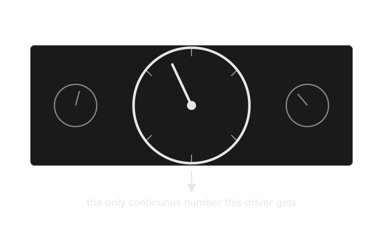
A gauge’s real value isn’t the number it shows at any instant — it’s that the number keeps moving, and a driver can watch it drift. An oil-pressure gauge lets someone notice pressure easing down over several minutes, long before any fixed threshold would trip a light. That’s diagnostic information a discrete on/off signal (next week’s subject) cannot carry: a slow drift and a sudden drop look identical to a light that only knows “fine” and “not fine.”
The reader the gauge assumes#
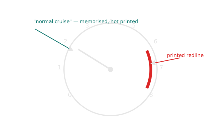
That value comes at a cost. A dial prints its danger zone in red, but it never prints the “normal” zone — the position the needle occupies during ordinary driving. A driver only knows that position from repetition: a few weeks in the same car, watching the needle enough times that its rest position becomes a felt fact rather than a read one. Rent an unfamiliar car and the redline is legible instantly; the normal cruising position isn’t, because nothing on the dial says so. Analogue gauges, in other words, assume a driver who drives this car, or one very like it, often enough to have built that memory beforehand — not a first-time or occasional driver reading it cold.
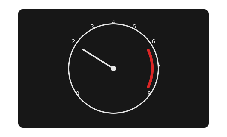 printed — the redlinenot printed — “normal cruise”
The same instrument, redrawn as a decision#
1. First drive Redline is legible instantly — it’s printed. Normal cruise position is not.
2. Repeated driving The driver watches the needle’s rest position across many ordinary trips.
3. Memory forms “Normal” becomes a felt fact — a learned position, not a printed one.
4. Reading is fast A glance now compares the needle to memory, not to anything on the dial.
An occasional or first-time driver never completes stage 2, which is why a rental car’s tachometer reads as “a needle somewhere in the safe two-thirds” rather than as useful information.
Case study: two dashboards, two claims about priority#
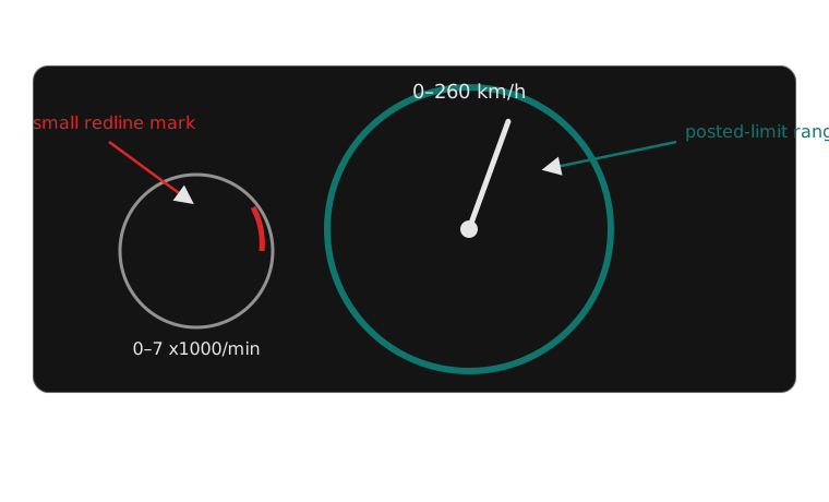
Porsche has centred the tachometer — not the speedometer — directly ahead of the driver since the 356 in the 1950s, through every 911 generation since, including current digital-instrument cars where swapping the priority would have been trivial. The speedometer sits smaller, to one side. The claim is specific: in a car whose engine range and gearing the driver is expected to actively manage, engine load is the number that needs the fastest, least effortful glance — faster than road speed.
Mainstream family cars make the opposite claim by centring the speedometer instead — a Toyota Camry, a Honda Accord, a Volkswagen Golf all put road speed in the largest dial, with the tachometer smaller or reduced to a digital strip, because the number with legal and safety consequences attached directly is the one the driver needs fastest, and an automatic transmission mostly manages engine behaviour on their behalf. Neither layout is simply correct; each is a design statement about what matters most to the driver in front of it, encoded before the car ever leaves the factory.
The continuous needle, read against last week’s six questions: low-to-medium urgency most of the drive, always foveal when the driver chooses to look (it is never used for anything peripheral), meaning that has to be learned rather than read off the dial, purely visual modality, timing that is continuous rather than a single event, and a required action that is usually “nothing yet” — the needle’s whole value is letting a driver notice a slow trend before any single reading would.
Next week: the idiot light — the same oil-pressure instrument, stripped down to a single point where a warning either is or isn’t lit, and what that trade gains and loses.
Teaching team
- Marisol Quaye — convenor