This is a student project for COMP4020 at ANU. The brief was to find a real
organisation you like with a website you don’t, and build them a better one. This
page is the argument: what the current site does to its visitors, and what this concept
does instead.
Not the Gardens’ site
Nothing here is operated by, endorsed by, or affiliated with the Australian National
Botanic Gardens, Parks Australia or the Director of National Parks. Nobody asked for
this. The Gardens’ real website is at
visit.anbg.gov.au and that is the one to use
for anything you intend to act on. The content here is the Gardens’ genuine
information, restructured and rewritten — not a claim to speak for them.
The organisation
Why the Botanic Gardens
The Australian National Botanic Gardens holds the largest living collection of
Australian native plants anywhere: over 70,000 plants, more than 4,300 species, on
ninety hectares of Black Mountain. It is free. It is a twenty-minute walk from the
middle of Canberra. And it is not a park that happens to have natives in it — it is a
national scientific collection with a herbarium and a seed bank attached, arranged so
that a person with no botanical training can walk out of a rainforest gully and into the
Red Centre in four minutes.
That last part is the thing worth admiring. Somebody made a decision, decades ago, that
this collection would be legible to ordinary visitors and not only to taxonomists —
that the Rainforest Gully would be built by installing a misting system in a dry fold of
a mountain, so that people in a cold inland city could stand in a rainforest. That is a
generous idea, executed patiently over fifty years.
The website does not extend that generosity. It is the only part of the institution that
makes the collection harder to reach than it needs to be.
The audit
What the current site gets wrong
I rendered the live site at both viewports and read its markup and its redirects. The
full audit, with every screenshot, is in research/anbg-audit/ in this
repository.
1. The homepage does not reflow on a phone
anbg.gov.au — measured at a 390×844 viewport
Mobile failure
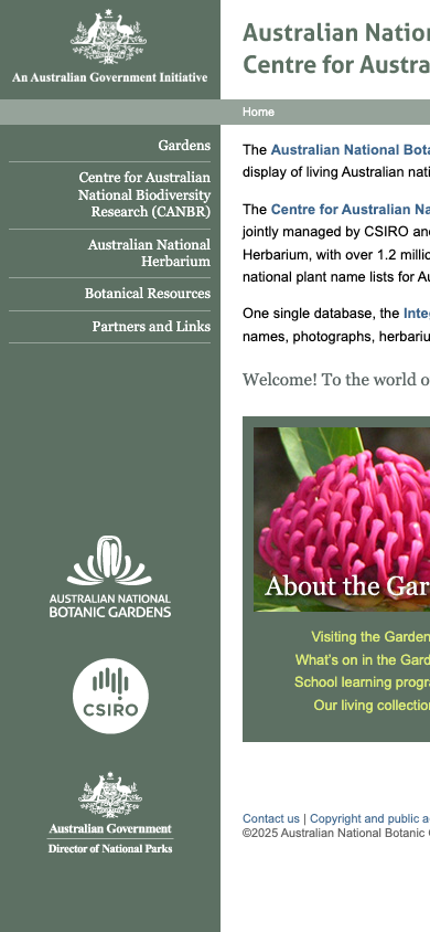
The Gardens’ primary URL is still, by its own markup, an HTML 4.01
Transitional document with an ISO-8859-1 charset and no<meta name="viewport"> tag. Its mobile strategy is a
media="handheld" stylesheet — a mechanism for early-2000s feature
phones that no iOS or Android browser has ever implemented. At a 390px viewport
the page renders its fixed ~1000px desktop layout unscaled and scrolls sideways.
The current homepage at 390×844. The layout never shrinks below its
desktop width, so the text is cut off mid-sentence.
This crit is marked at 1920×1080 and 390×844, and both count in full.
By that bar this single issue would fail the site outright.
2. Opening hours are nowhere on the homepage
and “What’s on” costs six redirects
Information architecture
Searching the homepage’s own HTML for “hours”,
“open”, “$”, “free” or
“admission” returns nothing. A first-time visitor is told about a
“Botanical Web Portal”, CANBR and IBIS before anything about when the
gate is open.
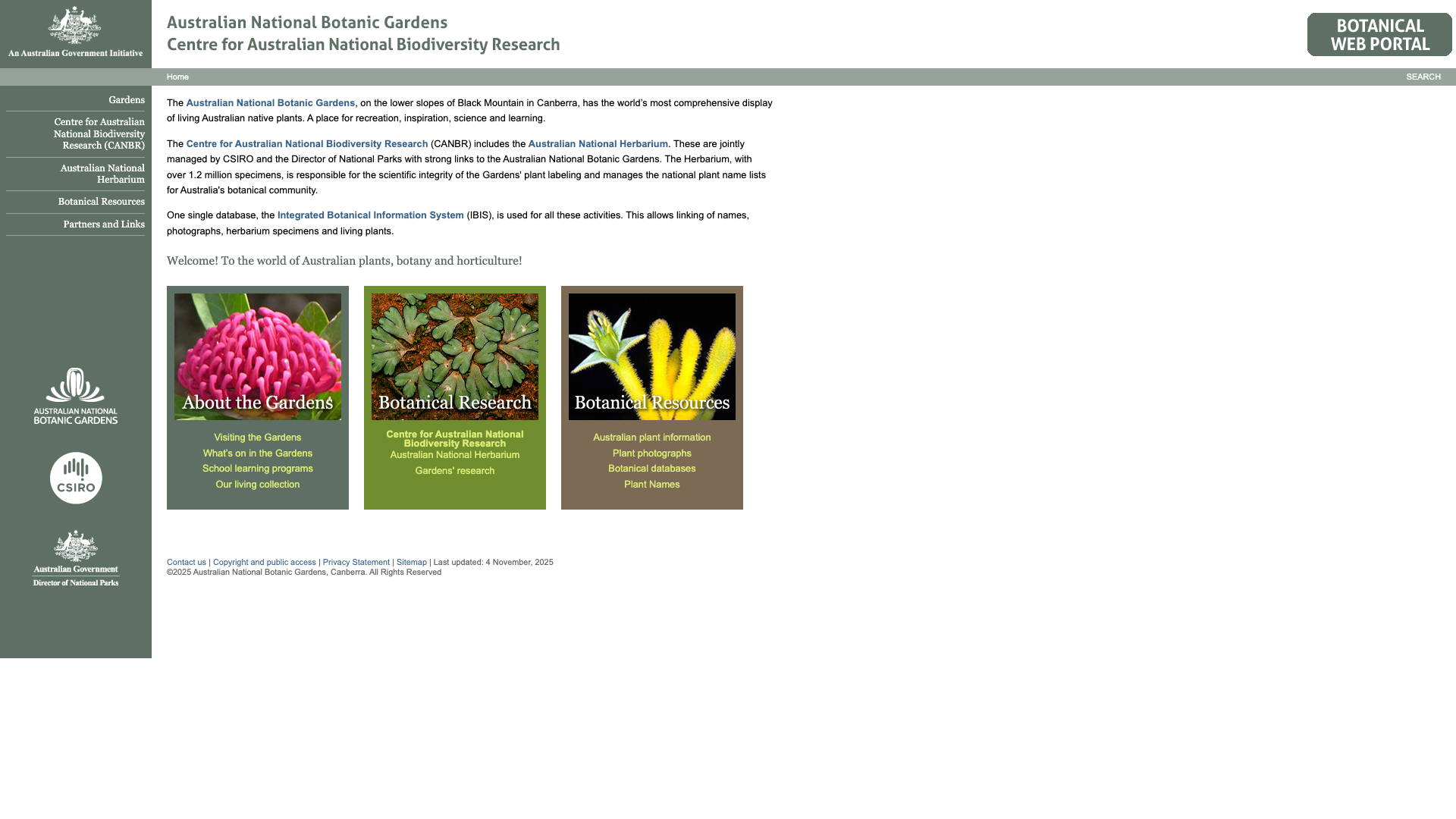
The homepage’s “What’s On” tile resolves through
six redirects across three hostnames before returning a 200 —
each hop a fossil of a past domain migration that was never cleaned up.
The current homepage at 1920×1080. Most of the canvas is empty, and none
of the four things a visitor came for is on it.
3. Five different visual designs, all live, all under one nav
homepage, About, Herbarium, Plant Info, Visiting
Consistency
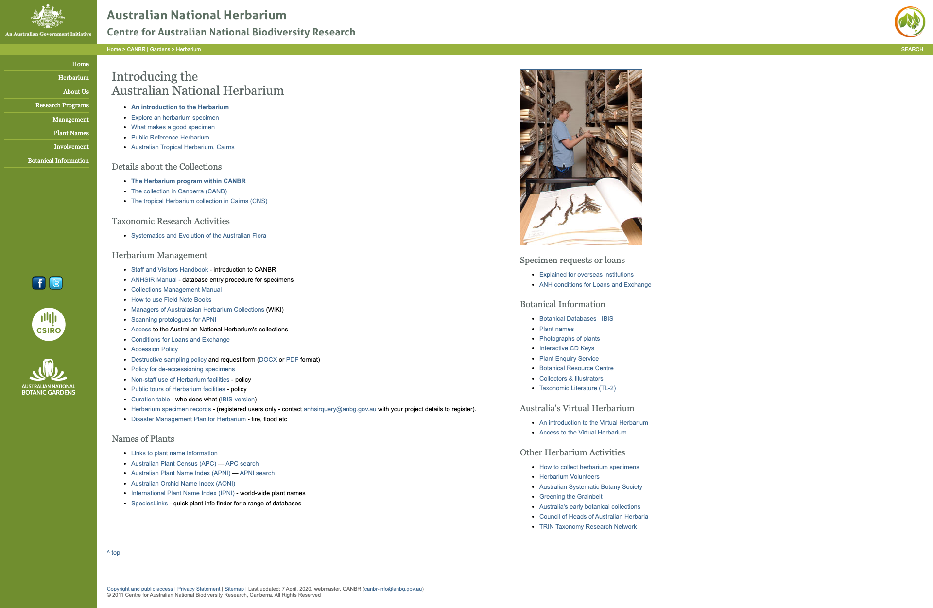
The legacy site does not have one dated look — it has several, changing page to
page: sage green on the homepage, olive with a circular badge on the Herbarium,
brown and tan with decorative postage-stamp imagery on Botanical Information. None
share a component library, a type scale, or a consistent footer. The About Us
footer has a “VISITING” column with no links under it at all.
The Herbarium page — a different colour scheme, a different nav structure, and
IBIS, ANHSIR, APNI and AONI unexplained in the main content.
4. Visitors and researchers share one undifferentiated site
Audience
CANBR, IBIS, CSIRO, ANHSIR, APC, APNI, AONI, IPNI, CANB and CNS all appear in
primary navigation or above-the-fold copy, unexplained. The research mission is
core to what the Gardens is, and it deserves its own section — but a parent
looking for opening hours currently has to filter out a paragraph about a specimen
database to find “Visiting” in a sidebar.
5. They already built the good site — it just isn’t the one links point at
visit.anbg.gov.au
What’s working
This deserves equal billing, because it changes what the fix is. Behind the legacy
portal, visit.anbg.gov.au is clean,
responsive, hero-led and organised around visitor tasks. It reflows properly on a
phone. The job is not inventing a better ANBG site from nothing — it is finishing
a migration the organisation already started and retiring what is left of the old
one.
visit.anbg.gov.au at 390×844 — genuinely responsive, unlike the domain
most links point at.
So this redesign is deliberately not a rebuke. It takes the direction the
organisation has already chosen and pushes it further.
This concept
What I changed, and why
Hours, entry, parking and address in the first screen
The four facts that were on no version of the homepage are now the component directly
under the hero, with the open/closed state computed live in Canberra time. This is
Finding 2, answered as directly as a page can answer it.
One design system, six pages
A single palette sampled from the Gardens’ own country, one type scale, one
shell. Every text-on-background pair is asserted against WCAG AA by a test that parses
the token file, so a nature palette cannot quietly become unreadable — which is the
usual failure mode of earthy colour schemes.
Responsive as a contract, not an intention
Every page was rendered and checked at 1920×1080 and 390×844, and nothing
scrolls sideways on a phone. That was Finding 1, and it is the easiest of these to
claim and the easiest to get wrong.
A reason to walk up the hill
The current site tells you the collection exists. This one tries to make you want to
stand in it: a stop-by-stop walk, an illustrated map that answers where the nearest
washroom is, and a matcher for the plant you could not name.
Ngunnawal plant use as a page, not a line
The Gardens publish an Aboriginal Plant Use Trail with Ngunnawal plant names in it.
That material is worth a page of its own, sourced and attributed claim by claim —
it has one.
Research content deliberately out of scope
Finding 4 says visitor and researcher paths should be structurally separate. This
concept builds the visitor path and does not attempt the herbarium and taxonomic
databases, which need their own information architecture and a specialist audience’s
input. Leaving it out is the honest version of separating them.
Straight answers
What this prototype is not
The map is not surveyed
The artwork conveys the shape of the place. Facility positions are placed to be
useful, not measured — so the bearings are exact arithmetic over approximate
inputs, and the page says so on the map itself.
The matcher cannot identify a plant
It compares colour distributions across eight species and applies a two-question
key. It is not a trained classifier, a static site cannot host one, and the page
leads with that rather than burying it.
The imagery is drawn, not photographed
Every illustration is hand-authored SVG. That avoids any licensing question over a
real organisation’s photography, and costs nothing to download — but a real
build of this would use the Gardens’ own photographs.
Eight species, not 4,300
The trail and the matcher cover eight plants. A real build would be driven from
the Gardens’ living-collection database, which is exactly the sort of thing
the institution already has and a static prototype does not.