Week 5: Red, amber, green: the grammar of urgency
How three colours came to carry the entire weight of automotive urgency, and what happens to a driver for whom two of them look the same
22 March 2027
Last week’s icons gave the dashboard a vocabulary of shapes — a fuel pump, a thermometer, a battery. This week asks a narrower and more dangerous question: before a driver has even parsed the shape, before they’ve read a single word, colour has already told them how worried to be. What is that system, where did it come from, and what happens to a driver for whom the system’s two most important colours are indistinguishable?
Colour arrives before comprehension#
Peripheral vision is fast and coarse. It resolves colour and motion well before it resolves shape or text, which is exactly why a telltale illuminating red pulls a driver’s eye off the road a beat before they’ve identified which telltale it is. This is a feature, not an accident: a dashboard designer is routing the most time-critical judgement — how urgent is this? — through the fastest channel the visual system has, and saving the slower channel (shape, text) for the second question, which is what, specifically, is wrong. Colour does triage. Icon does diagnosis.
A borrowed grammar, not an invented one#
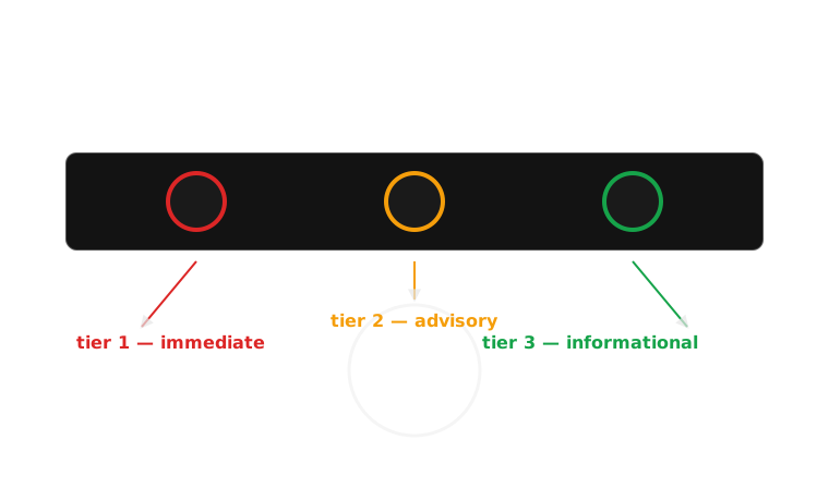
The SAE J209 / ISO 2575 telltale colour convention — red for immediate attention or hazard, amber/yellow for advisory or caution, green or blue for informational or confirmation — was not designed from scratch for cars. It is lifted, largely intact, from nineteenth-century railway semaphore and twentieth-century traffic signalling, where the same three-tier logic (stop, caution, proceed) had already been drilled into an entire population before a single one of them sat in a car. A dashboard designer specifying a red oil light in 1970 was not teaching drivers a new code; they were renting one that already lived in every driver’s head from the nearest traffic light.
The process: from fault to judgement#
Colour-coded urgency is the visible tip of a chain that starts well before the dashboard lights up.
1. Fault detected A sensor crosses a threshold — oil pressure drops, wheel speeds disagree.
2. Severity classified The car maps the fault to one of a small number of tiers.
3. Colour assigned Critical → red, advisory → amber, informational → green or blue.
4. Telltale illuminated In that colour, usually alongside its icon.
5. Peripheral vision registers Colour resolves before foveal vision has identified the icon.
6. Urgency judgement made Pull over / note it / no action — often before naming the icon.
Steps 1–4 happen inside the car in milliseconds; steps 5–6 happen inside the driver, and step 5 is the one that fails for a colour-blind driver.
Case study: the convention, and the population it fails#
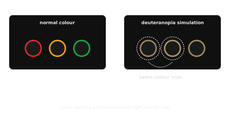
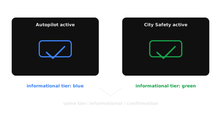
The convention’s strength is exactly its inheritance: no learning curve, works across languages, works at a glance. Its weakness is that it puts the entire urgency signal on one channel — hue — and asks that channel to carry a life-or-death distinction between exactly the two colours, red and green, hardest to tell apart for the roughly 1 in 12 men (and a much smaller fraction of women) with some form of colour-blindness, overwhelmingly red-green deuteranopia or protanopia. For that driver, a red brake-system warning and a green cruise-control confirmation can render as near-identical brownish-yellow. The system meant to let them triage without reading anything now gives no triage information at all — they’re thrown straight to reading icons and text, under the same time pressure, with the fast channel disabled. The fix already exists in the standard’s own margins: SAE and ISO telltales are also differentiated by shape, fill pattern and cluster position, redundancy a well-designed dashboard leans on and a cheap one doesn’t bother with. Colour should confirm, not carry, the whole signal.
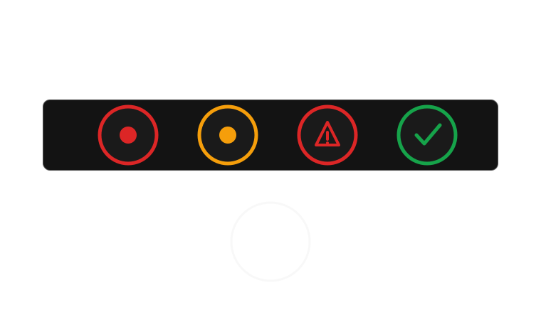 same dot shape, only colour differs — fails under deuteranopiadistinct shape — still legible with no colour at all
Colour, read against the six-question framework: it is the fastest available proxy for urgency, delivered through peripheral visibility rather than foveal — the whole design bet is that it works before a driver looks straight at it. Its meaning is almost entirely pre-learned, borrowed from traffic and rail signalling rather than taught by the car. Modality is visual only, which is exactly its failure point for colour-blind drivers. Timing persists for as long as the underlying tier holds, and the required action it implies is coarse but immediate — sort into stop, attend, or ignore, before any icon is read.
Next week the course adds a second channel entirely: sound. Idris takes the lecture, on the chimes and voices a dashboard can raise even when colour has already failed.
Teaching team
- Marisol Quaye — convenor