Week 5
Red, amber, green: the grammar of urgency
How does colour alone encode urgency, and what happens when that code fails?
Learning objectives
By the end of this week you should be able to:
- Explain why the SAE/ISO red-amber-green telltale convention was borrowed from railway and traffic signalling rather than invented for cars
- Identify the three urgency tiers (immediate/hazard, advisory/caution, informational/confirmation) and name a real telltale that belongs in each
- Describe the sequence of steps — from fault detection to a driver’s urgency judgement — that a single coloured light compresses into milliseconds
- Compare a colour-only encoding against a colour+shape+position encoding and state which telltales in a real cluster would survive a colour-vision failure
- Explain why roughly 1 in 12 men have a form of colour-blindness that specifically threatens the red/green distinction this whole system depends on
Opening example: the half-second scan
Picture a driver starting the car on a cold morning. For about two seconds, the instrument cluster runs a self-test and every telltale — brakes, oil, battery, ABS, airbag, seatbelt, TPMS — lights up at once in a wall of red, amber and green.
The driver does not read this wall. They scan it. And within that scan, without consciously trying, they’ve already sorted it: is anything still red once the self-test ends? That’s the only question that matters, and colour alone answers it before a single icon has been identified.
Opening example: what the car is actually saying
The self-test isn’t showing off — it’s proving every bulb still works, so a burned-out warning light doesn’t fail silently later. But the deeper point is what happens the instant the test ends and real status takes over: the car has, in that moment, assigned each of dozens of possible faults to one of three urgency tiers, and it is relying entirely on colour to transmit which tier applies, faster than the driver could read a single word.
That’s the design bet this whole week interrogates: colour as the fastest channel to the brain, and the single point of failure if that channel is unreliable for the person reading it.
Why colour, and why it’s fast
Peripheral vision resolves colour and motion well before it resolves shape, detail or text — the fovea (sharp, central, slow) has to be pointed at something before it can read it, but colour contrast registers across a much wider field, almost immediately. A dashboard designer exploits this deliberately: put the urgency signal in the fast channel (colour) and the diagnosis signal in the slow channel (icon, text).
This is why a red telltale pulls your eye before you know what it is. The car isn’t being subtle — it’s using the fastest wire it has.
Two separate questions, two separate channels
| Question | Channel | Speed | Example |
|---|---|---|---|
| How worried should I be? | Colour | Near-instant, peripheral | Red vs amber vs green |
| What, specifically, is wrong? | Icon / shape / text | Slower, needs foveal attention | Oil can icon, battery icon, ”!” in a circle |
Collapsing these into one channel — say, a cluster that used only greyscale icons with no colour coding — would force every urgency judgement through the slow channel. Colour is what lets triage happen before comprehension is even complete.
The process: from fault to judgement
Colour-coded urgency is the visible tip of a chain that starts well before the dashboard lights up:
- Fault detected — a sensor crosses a threshold (oil pressure drops, a wheel-speed sensor disagrees with the others)
- Severity classified — the car’s software maps that fault to one of a small number of tiers (critical / advisory / informational)
- Colour assigned by tier — critical → red, advisory → amber, informational → green or blue
- Telltale illuminated in that colour, usually alongside its icon
- Driver’s peripheral vision registers the colour before foveal vision has resolved the icon
- Urgency judgement made — pull over now / note it and carry on / no action needed — often before the driver could say out loud which icon it was
Every step from 1–4 happens inside the car in milliseconds. Steps 5–6 happen inside the driver, and step 5 is the one this week is about.
The same chain, as a diagram
Three tiers, not thirty
A dashboard could, in principle, use a wide colour gradient to express fine shades of urgency — pale yellow through orange through deep red. Almost none do. The SAE/ISO convention deliberately collapses urgency into exactly three categories:
- Red — immediate attention or hazard: stop as soon as safely possible
- Amber/yellow — advisory or caution: attend to it soon, not necessarily now
- Green or blue — informational or confirmation: a system is on and working as intended, no action needed
Three tiers is a cognitive-load decision, not a technical limit. A driver under time pressure can sort three buckets instantly; they cannot reliably sort thirty.
Real example: Volvo and the confirmation colour
Volvo’s clusters are a useful case because the brand’s entire safety positioning depends on drivers trusting the green/blue tier. When City Safety or adaptive cruise control is active, the confirmation indicator is deliberately calm — green or blue, steady, not blinking — precisely so it never competes visually with a red brake warning two centimetres away on the same cluster. The colour is doing reputational work as well as functional work: “the system you paid for is watching” has to look nothing like “stop the car.”
Real example: Toyota’s redundant coding
Toyota’s Safety Sense telltales are useful for the opposite reason: they rarely rely on colour alone even within a single tier. A lane-departure alert pairs its amber/red colour with a distinct icon shape (a car straddling a lane line) and, on many models, a position on the cluster consistently reserved for driver-assist status. This matters for this week specifically because it’s a real-world instance of the redundancy the colour-blind failure case is asking for — Toyota didn’t design it for colour-blind drivers specifically, but it accidentally helps them.
Comparison within the core content: BMW vs Mercedes-Benz
Two premium clusters solve “how much colour work should the cluster do” differently:
- BMW’s digital clusters (iDrive-generation) tend to keep the red/amber/green telltale bank fixed in position and colour meaning even as the rest of the cluster is reconfigurable — urgency colour is treated as a constant the driver can always trust regardless of what mode the cluster is in.
- Mercedes-Benz’s MBUX clusters allow more of the display, including some status colour, to shift with drive mode (Sport red-tinted themes, Eco green-tinted themes) — which risks the ambient colour of the display itself competing with the meaning-carrying colour of a telltale.
The comparison matters because it shows colour convention can be undermined by a manufacturer’s own styling choices, not only by a driver’s vision.
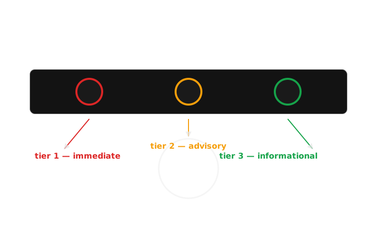
Three colours, three tiers, one glance: the cluster expects urgency to be sorted before any icon is read.
Real example: Honda’s amber “maintenance minder”
Honda’s Maintenance Minder is a useful edge case for the amber tier specifically, because amber is the tier most often stretched to cover things that aren’t really faults at all — a scheduled oil-change reminder uses the same amber wrench icon as a genuine low-oil-pressure advisory on some dashboards. This is a real design tension: amber is supposed to mean “attend to this soon,” but a system that cries amber for routine maintenance risks teaching drivers to deprioritise amber generally, which is a preview of week 10’s alarm-fatigue material.
Real example: Tesla and the informational tier
Tesla’s instrument display is worth including here because it mostly avoids green altogether for its informational tier, favouring white or blue text and icons instead — Autopilot/Full Self-Driving status, for instance, renders in blue-white rather than green. This is a legitimate variant within the ISO convention (green or blue is permitted for informational/confirmation), but it also means a driver moving between a Tesla and almost anything else is relearning which colour means “just letting you know” versus “go.”
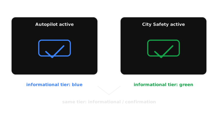
Same tier, different colour: the ISO standard permits both, but a driver switching cars has to relearn which one means ‘no action needed’.
Case study: a grammar borrowed from the railway
The SAE J209 / ISO 2575 telltale colour convention did not originate with cars. Red-amber-green as “stop / caution / proceed” was standardised for railway semaphore signalling in the nineteenth century, and carried into road traffic lights well before the mass-market dashboard existed. When engineers in the 1960s and 70s began specifying colours for the first telltale-light banks (replacing continuous gauges, as covered in week 3), they were not inventing a code — they were renting one that every literate driver already carried from the nearest intersection.
This is why the convention needs almost no explanation on a dashboard: red already meant “stop” to a driver before they ever sat in the car.
Case study: the failure the convention was never designed around
The convention’s entire load-bearing distinction — red versus green — is exactly the pair that fails for the most common form of colour-blindness. Roughly 1 in 12 men (about 8%), and a much smaller proportion of women (around 0.5%), have some form of colour-blindness, and the overwhelming majority of cases are red-green (deuteranopia or protanopia, affecting the green- or red-sensing cone cells respectively). For these drivers, a red brake-system warning and a green “system active” confirmation can render as close to the same washed-out brownish-yellow.
The convention assumed a channel — hue discrimination — that a meaningful fraction of its actual users do not reliably have.
Case study: what breaks, specifically
For a colour-blind driver, the fast channel described earlier simply doesn’t deliver a triage answer. The peripheral-vision glance that’s supposed to resolve “how worried should I be?” in milliseconds instead resolves to “something is lit, tier unknown.” That driver is pushed straight to the slow channel — reading the icon, sometimes reading text — under exactly the same time pressure as everyone else, but without the shortcut the whole system was built around. The failure isn’t cosmetic; it removes the very thing colour coding exists to provide.
The fix is already latent in the standard: SAE/ISO telltales are also specified with distinct icon shapes, fill patterns and, on a well-laid-out cluster, consistent positions by tier. A dashboard that leans on that redundancy degrades gracefully for a colour-blind driver; one that leans on colour alone doesn’t.
Comparison: normal vision vs deuteranopia, same cluster
| Aspect | Normal colour vision | Deuteranopia (red-green colour-blind) |
|---|---|---|
| Red brake warning | Bright red, unmistakable | Dull yellow-brown |
| Amber engine-check | Amber/orange | Similar yellow-brown — close to the “red” above |
| Green cruise-control confirmation | Green | Also a similar yellow-brown |
| What the glance resolves | Clear tier: stop / caution / fine | All three look nearly identical; tier unresolved |
| What rescues the judgement | Not needed — colour already worked | Icon shape, fill pattern, and position on the cluster, if the manufacturer included them |
The right-hand column is not a hypothetical edge case — it describes the lived experience of roughly 1 in 12 men on every drive they take.
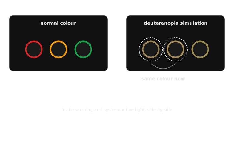
Run through a red-green colour-blindness simulation, a brake warning and a system-active light can become the same shade.
This week’s channel, against the framework
It is the fastest available proxy for urgency, delivered through peripheral visibility rather than foveal — the whole bet is that it works before a driver looks straight at it. Its meaning is almost entirely pre-learned, borrowed from rail and traffic signalling. Modality is visual only, which is exactly its failure point. Timing persists for as long as the tier holds, and the required action it implies is coarse but immediate: stop, attend, or ignore, before any icon is read.
Common misconception: “if a light is red, every driver reads it as urgent”
Most do. Roughly 1 in 12 men do not — not because they’re inattentive, but because red and green, the two colours this entire system leans on hardest, render as close to the same washed-out brownish-yellow under the most common form of colour-blindness. The misconception isn’t wrong about most drivers; it’s wrong about treating “most” as “all,” on a channel that was specifically chosen because it’s supposed to work without anyone having to try.
Classroom exercise: audit a cluster for colour-only risk
Working from a real dashboard photo (yours, a classmate’s, or a manual image), identify every telltale that is currently distinguished from its neighbours by colour alone — no difference in icon shape, fill, blinking pattern, or position that would survive if all the colours became identical.
Discuss in pairs:
- Which telltale pairs on this cluster would become ambiguous under deuteranopia?
- For each ambiguous pair, is there an unused shape, position or animation cue that could disambiguate them without adding colour?
- Is there a telltale here where colour is doing real work that text or shape genuinely couldn’t replace as fast?
- If you had to redesign one telltale on this cluster for colour-blind accessibility without removing colour for everyone else, what would you change?
Exercise debrief: a model answer
Two answer-shapes cover most audits:
- Telltales that already survive colour loss — brake, battery and oil warnings usually have distinct icon shapes layered on top of colour, so even under deuteranopia the shape alone still resolves which fault it is.
- Telltales that don’t — confirmation lights (cruise control active, seatbelt fastened, daytime-running-lights on) are the recurring offenders: small, colour-only, low-contrast icons designed as if the colour tier alone would always be legible.
The real constraint being tested: redundancy has to be built in at design time, because a colour-blind driver can’t add shape or position back to an existing telltale themselves. The cheapest fix groups often land on is reserving a fixed cluster position — a “problem zone” — for anything red-tier, so tier is recoverable from where a light is, not only its hue.
Mini knowledge check
- Where does the red-amber-green telltale colour convention originally come from, and why does that history matter for how quickly drivers learn it?
- Name the two colours that are hardest to distinguish for the most common form of colour-blindness, and explain why it’s a problem that those are exactly the two colours the SAE/ISO convention relies on most.
- A telltale is amber, has a unique icon shape, and always appears in the same position on the cluster. If a driver can’t perceive its colour at all, can they still identify its urgency tier? Why or why not?
- Give one real manufacturer example from this week where colour convention is used well, and one where it’s stretched thin.
Summary
- Colour is the fastest channel to a driver’s attention — faster than icon, faster than text — which is why it’s used to carry urgency, not detail
- The SAE/ISO red-amber-green convention wasn’t invented for cars; it’s inherited from railway and traffic signalling, which is exactly why it needs no explanation
- That inheritance has a cost: it puts the whole urgency signal on the one hue distinction — red vs green — that fails for the most common form of colour-blindness, affecting roughly 1 in 12 men
- Shape, fill pattern and cluster position are the standard’s own redundancy mechanism, already specified but inconsistently used
- A well-designed telltale degrades gracefully when colour fails; a colour-only telltale simply stops working for a meaningful fraction of drivers
Bridge to week 6: when colour isn’t available at all
Colour has one hard limit this week didn’t get to: it only works if the driver is looking at the dashboard at all. Eyes on the road, at night, in glare, or with a colour-vision deficiency — colour can fail or simply not reach the driver in time.
Week 6 picks up exactly where this week’s failure case leaves off: sound as a second, independent channel for urgency — one that doesn’t require looking anywhere. Idris teaches it, and the seatbelt chime’s mandated escalation is the case study: a system that gets louder and more insistent specifically because it can’t rely on being seen.
Next: Week 6 — Chimes, dings and voices
The sonic register — a channel that reaches the driver whether or not they’re looking, and whether or not they can see colour at all.