Week 4: Icons and symbols — building a shared vocabulary
How a tiny pictogram comes to mean the same thing across languages, literacy levels and decades, through the case of the tyre-pressure warning icon
15 March 2027
Last week ended with the idiot light: one bulb, one meaning, no gradation. That solved the problem of getting a driver’s attention, but it created a new one. A red light behind a wheel-shaped symbol, a light behind a thermometer shape, a light behind an exclamation mark in a tyre — each is a different icon standing in for a different fault, and none of them is self-explanatory the first time you see it. This week asks the question the idiot light ducked: how does a symbol earn a meaning that a driver can recognise without having read the manual?
An icon is a bet, not a translation#
A pictogram is often described as if it were a universal translation of a warning into a language-free picture. It isn’t. A cross-section of a tyre with an exclamation mark inside it does not obviously mean “one of your tyres is underinflated” to someone who has never been told that. It is a bet that a driver will learn the association once, remember it, and recognise it under stress in a different car years later. That bet only pays off if essentially every manufacturer is making the same bet with the same symbol — otherwise the driver has memorised four different icons for four different brands and forgotten which is which by the time it matters.
 tyre cross-section — names the system, not the faultexclamation mark — the only part that says “attend to this”
Convergence has to be engineered#
Shared symbols do not emerge from good taste. Left alone, manufacturers draw the same warning in incompatible ways, because each one is solving their own styling and legal problems, not the driver’s recognition problem. A shared icon vocabulary appears only when something forces competitors to stop differentiating on a feature drivers need to recognise instantly regardless of which car they’re in.
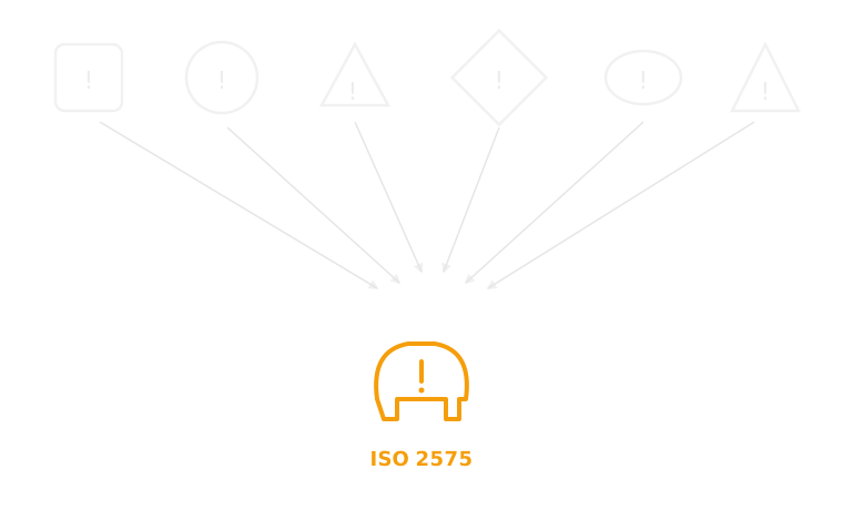
How an icon vocabulary becomes shared#
This doesn’t happen by manufacturers quietly agreeing it would be nice — it follows a fairly consistent, regulator-driven sequence.
1. Symbol designed A manufacturer draws a symbol for a function only it currently offers.
2. Function mandated A regulator requires the underlying function, not any particular icon.
3. Symbols compared Competing symbols are submitted or surveyed across manufacturers now forced to add the same feature at once.
4. Standard drafted A standards body (ISO/SAE) selects or drafts one shared symbol.
5. Standard propagates Manufacturers redesign clusters to comply and avoid maintaining a non-standard alternative.
6. Drivers learn it Repeated exposure across different cars is the step that actually makes the icon “shared” rather than merely “specified”.
Case study: the tyre-pressure icon#
Before 2000, a low-tyre-pressure warning, where it existed at all, was whatever the manufacturer’s design team drew: some used a simple ”!” in a circle indistinguishable from a dozen other generic faults, others used a wheel-and-tyre side profile, others buried the warning as text in a multi-function display with no icon at all. There was no shared visual grammar, because there was no shared requirement to have tyre-pressure monitoring in the first place.
That changed after the Ford Explorer/Firestone rollover controversy of the late 1990s, in which tread separation on under-inflated tyres was linked to a wave of fatal rollovers. The US TREAD Act (2000) responded by mandating tyre-pressure monitoring systems (TPMS) on new vehicles sold in the US, phased in through the mid-2000s. Once TPMS was legally required rather than a premium option, every manufacturer needed a dashboard symbol for the same new function, at the same time, for a regulator that wanted the meaning to be checkable. The industry converged on the ISO 2575 pictogram — a cross-section of a tyre with an exclamation mark — within roughly a decade, and it now appears, essentially unchanged, on cars from every major manufacturer sold anywhere the ISO standard is referenced. It is one of the cleanest examples in the whole vocabulary of a symbol becoming standard through regulatory pressure rather than organic taste convergence: the mandate came first, and the shared icon was the industry’s fastest way to comply without each firm bearing the cost of teaching drivers a brand-specific symbol from scratch.
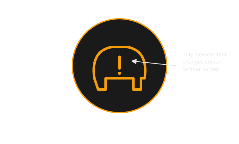
The icon, read against the six-question framework introduced in week 1: urgency the icon itself cannot express (it names which fault, not how bad), typically foveal since a driver has to look at and identify the shape, meaning that is entirely learned rather than self-evident, purely visual modality, timing that persists for as long as the underlying fault does, and a required action that the icon alone under-specifies — “check your tyres soon” and “pull over now” can trigger the identical amber pictogram.
Assessment 1, the Alert Audit, is due this Friday — and cataloguing a real dashboard’s icons, deciding which ones are genuinely legible versus merely familiar, is exactly the skill this week practised. Next week stays with the same icons and asks what a shape alone still can’t say: how urgent is this, right now — the job colour does.
Teaching team
- Marisol Quaye — convenor