Week 4
Icons and symbols: building a shared vocabulary
How does a tiny icon come to mean the same thing across languages, literacy levels, and decades?
Learning objectives
By the end of this week you should be able to:
- identify a dashboard icon that would fail to communicate to someone seeing it for the first time, with no caption
- explain why a shared icon vocabulary requires regulation or a standards body, not just good design taste, to actually converge
- compare two manufacturers’ pre-standardisation symbols for the same warning and state which design assumption each one made about the driver
- trace the TPMS icon’s path from manufacturer-specific symbol to ISO 2575 pictogram, naming the regulatory trigger at each stage
- distinguish, on a real dashboard, an icon that is legible on its own from one that is legible only because the driver already knows the car
Opening example: a light you’ve never seen before
A driver starts a car they don’t own — a rental, a partner’s car, a loaner while their own is serviced. A small amber icon lights up on the cluster: a rounded shape with a horseshoe outline and an exclamation mark inside it.
They have never seen this exact icon before. Is it urgent? Is it about the engine, the brakes, the tyres, something electronic they’ve never had to think about? The manual is in the glovebox, in a language they may or may not read fluently, indexed by a numbering system they don’t know.
Opening example: what the car is trying to say
The car is not being obscure on purpose. It is trying to compress a specific, checkable fact — “one of your tyres is below its target pressure” — into a shape small enough to fit in a cluster the size of a coin, readable in under a second, in a car the manufacturer expects to be driven by people who never read the manual cover to cover.
That compression only works if the driver already has the shape memorised from a different car. This is the whole problem of the week: an icon is useless the first time and nearly automatic the fiftieth time, and the gap between those two states is where a shared vocabulary either does or doesn’t exist.
What makes an icon “shared” rather than just “used”
A manufacturer can use an icon on every car it sells for twenty years and it still isn’t shared — it’s just familiar to that manufacturer’s customers. A shared icon has to survive being carried out of its home brand: an ISO-standard tyre-pressure icon means the same thing whether the driver last saw it on a Toyota, rented a Volkswagen, and is now looking at it in a Volvo. That portability is the entire point, and it is not a property individual manufacturers can create by themselves, however well they design.
Three grammars, one zoom-in
Weeks 2 and 3 established two grammars: the continuous needle (read a trend) and the binary idiot light (read a threshold crossing). This week zooms into what fills that light once it stops being a bare bulb — the icon inside it. An icon adds a third axis idiot lights don’t have: which of several possible faults is this, without needing a different physical lamp for each one. A single amber telltale housing can mean twenty different things across twenty different cars purely by swapping the pictogram behind the glass.
Comparison: two pre-standard tyre-warning icons
Before TPMS was mandated, two manufacturers solving the same problem — warn the driver about a soft tyre — made visibly different bets about what the driver already knew.
| Aspect | Manufacturer A (generic alert reuse) | Manufacturer B (literal wheel icon) |
|---|---|---|
| Symbol | Plain ”!” inside a circle | Side-profile wheel and tyre outline |
| Design assumption | Driver will check the manual to disambiguate which system this generic symbol refers to | Driver will recognise a wheel shape without training |
| Strength | Cheap to produce, reused existing tooling | Narrows the guess to “something about the wheels” |
| Weakness | Indistinguishable from a dozen other generic faults on the same dashboard | Still doesn’t say pressure specifically — could look like a flat, a brake fault, a sensor fault |
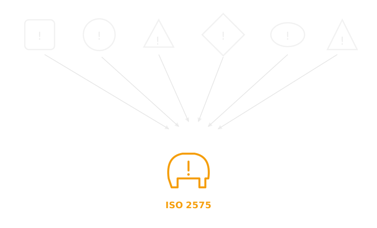
Before ISO 2575, “check your tyre pressure” had no fixed shape — after it, it had exactly one.
Real example: Toyota and staggered market rollout
Toyota is useful here because it sold TPMS-equipped and non-TPMS-equipped versions of very similar models simultaneously across different markets through the 2000s, as the US mandate phased in ahead of other regions. The same nameplate could carry the ISO tyre-pressure icon in one market and nothing equivalent in another, for the same generation of car. That split makes the regulatory trigger visible in a way a single-market manufacturer can’t show you — the icon didn’t spread because Toyota decided tyre pressure mattered more in the US, it spread because the US legally required it there first.
Real example: Volvo and the safety-first exception
Volvo is useful for the opposite reason. Volvo’s stated brand identity is safety leadership, and TPMS appeared on Volvo models before it was legally required in several of Volvo’s markets. This is the case that tests the week’s claim: didn’t a safety-focused manufacturer converge on this icon voluntarily, without regulation? Mostly no — Volvo adopted the function early, but still used the ISO 2575 icon, not a proprietary Volvo symbol, once the standard existed. Volvo led on fitting the sensor; it followed the standards body on drawing the icon.
Real example: Honda and icon simplification across trims
Honda sells the same core model across many trim levels with different cluster hardware — a basic analogue cluster in an entry trim, a configurable digital display in a higher one. The tyre-pressure icon is one of the few elements that stays pixel-for-pixel identical across that whole spread, even as everything around it changes resolution and layout. That consistency is deliberate: a standardised icon is exactly the element a manufacturer can’t afford to reinterpret trim-to-trim, because its entire value is that it looks the same everywhere.
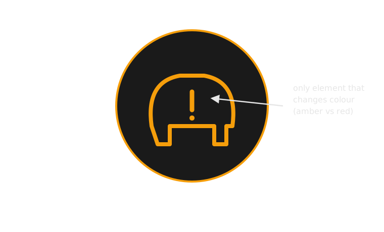
The pictogram that won: a tyre cross-section and an exclamation mark, unchanged across manufacturers since the mid-2000s.
How an icon vocabulary becomes shared: the process
This doesn’t happen by manufacturers quietly agreeing it would be nice. It follows a fairly consistent sequence:
- A manufacturer designs a symbol for a function only it currently offers, with no expectation anyone else will use it
- A regulator mandates the function itself (not the symbol) — TPMS after the TREAD Act required the underlying sensor, not any particular icon
- Competing symbols are submitted or surveyed across manufacturers now forced to add the same feature at the same time
- A standards body (ISO/SAE) selects or drafts one symbol — ISO 2575 for tyre pressure, drawing on but not identical to any single manufacturer’s original design
- The standard propagates as manufacturers redesign clusters to comply and avoid the cost of maintaining a non-standard alternative
- Drivers learn it through repeated exposure across different cars, which is the only step that actually makes the icon “shared” rather than merely “specified”
The same process, as a diagram
Case study: before regulation, chaos
Before TPMS existed as a legal requirement, a manufacturer that wanted to warn about tyre pressure at all had to invent the warning from scratch, with no shared reference to design against. The result across the industry was genuinely inconsistent: generic exclamation marks reused from other warning categories, literal wheel-and-tyre side profiles, occasionally no icon at all — just a line of text buried in a multi-function display menu a driver had to actively page through to find. None of these were wrong, exactly. Each was a reasonable local answer to a problem nobody had agreed on a shared solution for yet.
Case study: the TREAD Act forces the issue
The trigger was not a design competition — it was a product-liability crisis. Tread separation on under-inflated Firestone tyres fitted to Ford Explorers through the 1990s was linked to a wave of rollover deaths. The US TREAD Act (2000) responded by mandating tyre-pressure monitoring systems on new vehicles, phased in through the mid-2000s. This is the pivotal fact of the case study: the law mandated the sensor and the warning function, not any specific pictogram. The icon convergence that followed was an industry response to that mandate, not a term written into the law itself.
Case study: convergence and its consequences
With every manufacturer suddenly required to add the same function on the same rough timeline, drawing a brand-new proprietary icon carried a real cost with no offsetting benefit — a driver has to relearn it, a translator has to localise any accompanying text, and a lower-cost competitor could simply adopt the ISO 2575 pictogram and skip the design and validation work entirely. ISO 2575 became the default not because it was provably the best possible drawing of the concept, but because it was the shared answer that let every manufacturer stop treating the icon as brand differentiation. The consequence for the driver is real: within about a decade, the same amber tyre-cross-section icon meant the same thing in almost any new car, in almost any country the standard reached.
Case study: what’s still imperfect
Convergence on the icon didn’t solve everything. The pictogram alone still doesn’t say how urgent the situation is — a slow seasonal pressure drop and a rapid puncture can trigger the identical amber icon, with the driver left to infer severity from context the icon doesn’t carry. A synthesis worth proposing: keep the shared ISO shape (its portability is the whole achievement), but let severity ride on a second channel — colour, a flashing state, or a paired chime — rather than asking one static pictogram to carry both “which fault” and “how bad.” That handoff is next week’s subject exactly.
Comparison: icon alone vs icon plus text, same alert
| Aspect | Icon only (ISO 2575 pictogram, no text) | Icon plus text (“Check tyre pressure”) |
|---|---|---|
| Speed to recognise (trained driver) | Fastest — sub-second, no reading required | Slower — requires reading, even briefly |
| Speed to recognise (first-time driver) | Slowest — meaningless without prior exposure | Faster — text disambiguates immediately |
| Localisation cost | None — the pictogram doesn’t change across languages | Full translation cost per market |
| Failure mode | Silent failure: driver ignores an icon they don’t recognise | Failure mode is legibility, not recognition — small text at speed is its own problem |
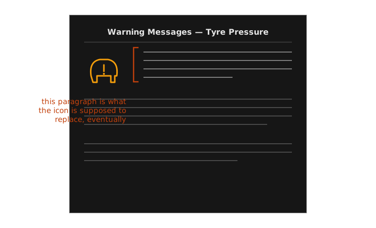
Early mandated TPMS icons still needed a manual paragraph to back them up — the icon hadn’t been learned yet.
Why some warnings never converge
Not every icon reaches ISO-level agreement, and the tyre-pressure case is instructive partly by contrast. Mazda and Volkswagen both still use check-engine-adjacent icons that vary slightly in outline and internal detail between models, because no single-purpose mandate ever forced a convergence event the way the TREAD Act did for tyre pressure — the check-engine light traces back to on-board-diagnostics regulation aimed at the sensor, not the pictogram, and diagnostic complexity behind it never compressed into one clean, universally agreed shape the way “tyre is soft” did. Regulation forces convergence only when it targets a single, narrow, checkable fact — the narrower the fact, the more convergeable the icon.
This week’s channel, against the framework
Urgency the icon cannot express by itself — it names which fault, not how bad. Typically foveal, since a driver has to look at and identify the shape. Meaning entirely learned, never self-evident. Purely visual modality. Timing persistent for as long as the fault holds. Required action under-specified — “check it soon” and “pull over now” can trigger the identical amber pictogram.
Common misconception: “a good icon should be self-explanatory”
It shouldn’t have to be, and mostly isn’t. No pictogram is self-explanatory to a genuinely first-time viewer — the ISO tyre icon reads as obvious now only because it has been seen dozens of times, on multiple cars, across years. A tyre cross-section with an exclamation mark is not intrinsically graspable; it is a learned shorthand that happens to have converged industry-wide, which is a completely different achievement from being inherently clear.
The tell: go back to the opening rental-car example. The icon in that scenario was, by hypothesis, a plausible variant a driver had genuinely never seen. Nothing about its shape alone resolved the ambiguity — only prior exposure would have.
Classroom activity: audit an icon set cold
Task: In pairs, take the sheet of unlabelled dashboard icons handed out in this week’s studio (or a set you gather from three different owner’s manuals). Without looking anything up, write down your best guess for each icon’s meaning and your confidence (high / medium / low).
Then inspect: which icons did both partners guess identically and confidently? Which produced disagreement?
Discuss:
- For the icons you both got right, was that because the shape is genuinely self-explanatory, or because you’d both already seen it before?
- Pick one icon you got wrong — what did its shape suggest to you instead of the real meaning, and why was that a reasonable misreading?
- If you had to design a brand-new icon for a genuinely new car function tomorrow, what would you do differently knowing it takes a decade of regulatory pressure to make a symbol actually shared?
Exercise debrief: what a good answer looks like
Two answer-shapes tend to cover most pairs’ results:
- Icons you both got right, confidently — almost always the heavily regulated ones (ISO tyre pressure, fuel pump). The real explanation is repeated exposure across many cars over a decade-plus of standardisation, not that the shape is obvious in isolation.
- Icons that produced disagreement — usually generic ”!” triangles and battery/charge symbols, where several genuinely different faults share a visually similar shape and no single regulatory push ever forced one drawing to win.
The underlying constraint the exercise is really testing: recognition speed tracks regulatory age, not perceived cleverness of the drawing. A harder question worth sitting with afterwards — if a genuinely new function (say, an EV battery thermal-runaway warning) needs an icon today, with no TREAD Act equivalent forcing convergence, what’s the fastest realistic path to it becoming shared rather than merely used?
Mini knowledge check
- What did the US TREAD Act (2000) actually mandate — the sensor function, or the icon design? Why does that distinction matter to this week’s argument?
- Name one manufacturer example from this deck where the icon and the underlying function were adopted on different timelines, and explain why.
- Why does a shared icon reduce localisation cost compared to a text warning for the same fault?
- Scenario: a new EV feature needs a dashboard warning with no existing ISO symbol. Based on this week’s flow, what’s the fastest realistic path to that icon becoming genuinely shared across manufacturers?
Summary
- An icon is a bet that a driver has learned its meaning somewhere else — it fails the first time and works almost automatically after repetition
- Shared icon vocabularies are engineered, not discovered: manufacturers left alone differentiate, they don’t converge
- The TPMS/ISO 2575 case shows the mechanism precisely: TREAD Act mandates the function (2000) → industry convergence on one pictogram follows within roughly a decade
- Convergence happens fastest around a single, narrow, checkable fact — broader or fuzzier warnings (like check-engine) resist it
- A converged icon still can’t say everything on its own — it names which fault, not how urgent
Bridge to week 5: an icon still needs a colour
Everything this week converged on was shape: one pictogram, one meaning, recognised regardless of which car it’s mounted in. But the tyre icon on its own can’t distinguish a slow seasonal pressure drop from a rapid puncture headed toward a blowout — both fire the identical amber symbol. Shape answers which fault; it doesn’t answer how urgent. Week 5 takes the icon vocabulary this week built and asks what red, amber and green are each doing to that same fixed shape — the grammar of urgency that a standardised pictogram, by itself, still can’t speak.