Week 3: The idiot light
What is lost, and what is gained, when a continuous measurement becomes a single light?
From the 1950s–60s US gauge-to-light shift to the modern check-engine light
Learning objectives
By the end of this week you should be able to:
- identify whether a given telltale is switched from a continuous signal or a genuinely binary one
- explain why US manufacturers replaced oil-pressure and ammeter gauges with warning lights in the 1950s–60s, in the terms manufacturers themselves used
- compare a continuous gauge and a single warning light across precision, glanceability, cost, and behaviour right before failure
- describe why the check-engine light is the idiot light’s logic taken to its most ambiguous extreme
- propose at least one concrete way to recover some of the lost information without returning to a full gauge
Opening example: the light comes on
You’re driving. An amber engine-shaped icon lights up on the cluster. No number, no word, no colour change if it gets worse. It stays on, steady, until you turn the engine off and on again or a mechanic clears it.
That single icon is standing in for one of several hundred possible stored diagnostic trouble codes — a loose fuel cap, a failing oxygen sensor, a misfiring cylinder that could be quietly destroying your catalytic converter right now. The car knows which one. The dashboard doesn’t tell you.
Opening example: what the driver actually knows
Everything the check-engine light gives the driver is contained in the fact that it is on. It does not say:
- how urgent — pull over now, or fine until the weekend
- how expensive — a $2 fuel cap or a $2,000 catalytic converter
- whether it’s getting worse — the light doesn’t brighten, blink faster, or change colour as a small problem becomes a large one (with one narrow exception we’ll get to)
This is the end state of a design lineage that starts with the oil-pressure gauge disappearing from a 1958 Chevrolet. Today’s lecture traces that lineage.
What a gauge encodes that a light throws away
A continuous gauge carries at least three kinds of information a binary light cannot:
- Magnitude — not just “low,” but how low: 15 psi is not 2 psi.
- Rate of change — a needle drifting down over ten minutes looks different from one that drops in a second; a light only ever switches.
- Trend across time — a driver who checks the gauge daily builds a mental baseline (“it usually sits just above centre”) and notices deviation from their car’s normal, not a generic threshold.
A light collapses all three into one fact: are we above the line, or below it. That is not a smaller version of the same information — it is a different kind of information.
Why manufacturers made the swap
Through the 1950s, US manufacturers’ own research kept turning up the same result: a large share of drivers either never looked at the oil-pressure or ammeter gauge, or looked at it without knowing what a normal reading was for their car. An instrument that isn’t read correctly isn’t delivering continuous information at all — it’s delivering nothing, while still costing dashboard space, wiring, and a sending unit to manufacture.
Read that way, the decision wasn’t a downgrade. It was a correction: stop paying for precision nobody was using, and spend the saving on a signal nobody can misread. The idiot light is a rational response to a real measured failure of the gauge, not just cheapness.
The mechanism: how an idiot light actually works
An oil-pressure telltale is wired to a pressure switch, not a pressure sensor. The switch has exactly one job: close a circuit (lighting the lamp) when pressure falls below a fixed threshold, and open it (extinguishing the lamp) above that threshold. There is no wiring path for “pressure is fine but declining” — the switch physically cannot represent it. The ammeter’s replacement, an idiot light on the charging system, works the same way off a voltage comparator.
This is the process worth holding onto for the rest of the week: a continuous physical quantity, reduced to one threshold, reduced to one circuit state, reduced to one lamp. Every later telltale — tyre pressure, brake fluid, check engine — inherits this same shape.
Process: from sensor reading to lit lamp
| Stage | What exists | What survives to the next stage |
|---|---|---|
| 1. Continuous signal | Oil pressure, 0–80 psi, changing constantly | Everything |
| 2. Threshold check | Compare reading to a fixed cutoff (e.g. 7 psi) | One bit: above / below |
| 3. Binary decision | “Fine” or “not fine” — nothing in between | The bit only |
| 4. Single light | Lamp off, or lamp on | Nothing more than “attend now” |
Every value from 8 psi to 80 psi is stage-1 information that stage-4 renders identically to every other value in that range: fine. The driver at 9 psi and the driver at 79 psi see the same dashboard.
The same process, as a diagram
Stage 1 Continuous signal — oil pressure, 0–80 psi, changing constantly
Stage 2 Threshold check — compare the reading to a fixed cutoff (e.g. 7 psi)
Stage 3 Binary decision — “fine” or “not fine,” nothing in between
Stage 4 Single light — lamp off, or lamp on
Each arrow is a place information is thrown away, not just relayed forward.
Real example: the 1958–1965 US full-size sedan
By the late 1950s, full-size Chevrolets and Fords were shipping with a telltale-only instrument panel as standard equipment — an oil-pressure light and a charge light where a gauge used to sit — with the full gauge package sold back as an extra-cost option on some trims. This is a rare case where the cheaper version and the simplified version were the same car: buyers who wanted the old continuous readout had to pay to get it back. That inversion — simplicity as the default, precision as the upsell — is the detail worth remembering when the case study returns later in the lecture.
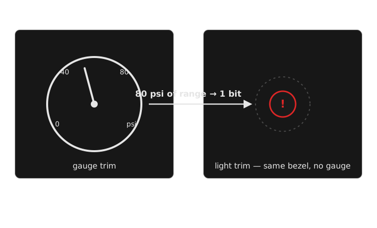
Same model, same year, two different answers to the same question.
Real example: BMW Check Control
BMW’s Check Control system, introduced in the early 1980s, is an attempt to put some of the lost information back — not by returning to a gauge, but by adding a short text sentence alongside the light: “CHECK BRAKE LIGHT” rather than a single generic lamp. It’s useful for this week because it shows that the binary switch (something’s wrong / it isn’t) and the vocabulary naming what’s wrong are separable design decisions — you can keep the one-bit trigger and still fix the ambiguity by spending words on it. That’s next week’s topic; here it’s evidence that manufacturers noticed the same gap you’re noticing now, decades before the check-engine light existed.
Real example: Honda’s blinking check-engine light
Honda’s dashboards (like most OBD-II-compliant cars) use one lamp in two patterns: steady illumination for most stored fault codes, but a flashing malfunction indicator specifically for an active misfire severe enough to damage the catalytic converter within a short drive. This is the idiot light’s one-bit logic smuggling in a second bit through timing rather than a second lamp — useful here because it’s the cheapest possible fix (no new hardware, no new colour) and it still only distinguishes “urgent” from “not urgent,” not which of several hundred codes triggered either state.
Real example: Volvo’s TPMS convention
Many Volvo models (and most tyre-pressure-monitoring systems built to the same convention) use a steady low-pressure telltale to mean “a tyre is underinflated” and a flashing version of the same lamp to mean “the monitoring system itself has a fault and can’t tell you.” It’s useful here as a direct contrast with Honda’s blink convention: same technique (steady vs flashing), applied to distinguish a measured problem from an unmeasured unknown rather than to rank urgency. Two manufacturers, the same one extra bit, spent on two different distinctions.
Comparing two interface approaches directly
Full gauge package (optional, late-1950s trim) vs standard telltale package (same car, base trim): the gauge lets an attentive owner catch a slow oil-pressure decline over weeks, at the cost of a component owners statistically weren’t reading correctly. The telltale guarantees every owner notices a problem, at the cost of guaranteeing none of them see it coming. Neither approach is a strict improvement on the other — they’re optimising for different failure modes: the rare owner who reads gauges well, versus the common owner who doesn’t.
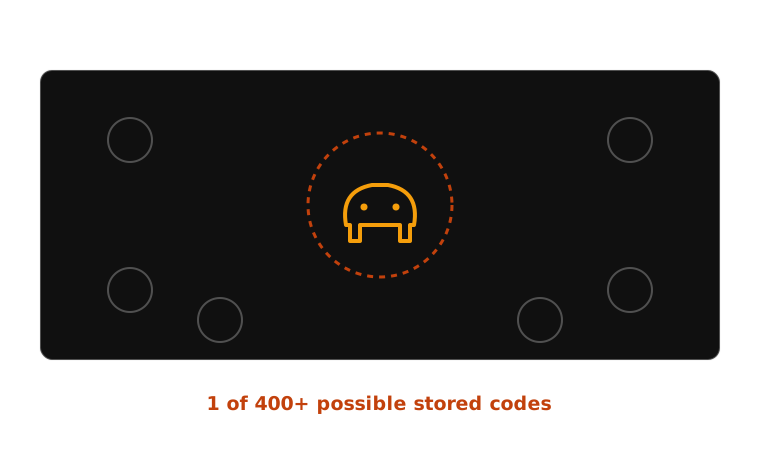
The dashboard’s entire message is: something is wrong. Somewhere.
Case study: the check-engine light’s ambiguity
The check-engine light (the malfunction indicator lamp, standardised under OBD-II in US vehicles from 1996) inherits the idiot light’s exact shape — sensor, threshold, binary decision, one lamp — but the mapping from “on” to “cause” exploded. Where an oil-pressure light has one plausible cause behind it, a modern MIL can be triggered by any of several hundred distinct diagnostic trouble codes stored in the engine control unit, covering everything from a loose fuel cap to a failing catalytic converter. The lamp’s design intent — guarantee every driver notices something — succeeds completely. Its cost is that the driver learns nothing about what, and the dashboard has no vocabulary for telling them apart.
Case study: consequences for the driver
Because the light can’t distinguish severity, drivers rationally learn to distrust it in exactly the way alarm designers dread: some check-engine triggers really are a loose fuel cap that clears itself in a day or two, and some are a misfire actively damaging a catalytic converter with every kilometre driven. A driver who has been safely ignored the light twice before has no dashboard-level reason to treat the third instance differently — the interface gives identical signals to a $40 problem and a $2,000 one. This is an early, mild version of the alarm-fatigue problem week 10 covers in full: ambiguity, sustained long enough, teaches drivers to downweight the alarm itself.
Case study: a synthesis worth wanting
The fix doesn’t require abandoning the one-bit lamp — it requires spending a second signal alongside it, the way BMW’s Check Control and Honda’s blink convention each already do in miniature. A synthesis: keep the guaranteed, unmissable lamp for “attend to this,” but pair it with a severity tier (a distinct colour or blink pattern for “drive-damaging now” versus “schedule a service”) and route the actual diagnostic code to wherever the driver already looks for detail — a companion app, a multi-info display, a dealer scan tool. That’s not a hardware problem any more. It’s a vocabulary problem, which is where next week starts.
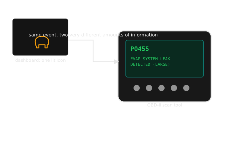
Everything the dashboard didn’t tell you was sitting in the car the whole time.
The full signal chain, and where it collapses
Sensor reading Oil pressure, temperature, or an ECU fault code — continuous or discrete, but rich survives
Interpretation & severity Software or a switch decides what the reading means and how urgent it is thin
Presentation One lamp, one colour, one icon — whatever the dashboard has to show it with collapses
Driver interpretation The driver reconstructs meaning from a single bit and whatever they remember collapses
Response Pull over, ignore, or guess — the driver’s action, built on what’s left thin
This is the same shape as the four-stage table earlier, drawn wide enough to show where a fix (Check Control’s text, Honda’s blink) actually lands: at presentation, the one stage a manufacturer can improve without new sensors.
Comparison: continuous gauge vs single warning light
| Dimension | Continuous gauge | Single warning light |
|---|---|---|
| Precision | Exact value, any point in range | One bit: above or below threshold |
| Glanceability | Requires reading a position against a learned baseline | Instant — lit or unlit, no interpretation |
| Manufacturing cost | Sensor, mechanical or electronic gauge, wiring | Simple switch/comparator, one lamp |
| Right before failure | Trend visible in advance, if the driver was watching | Often silent until the threshold is crossed |
| Cost of driver inattention | High — an unread gauge gives no warning at all | Low — impossible to misread when lit |
Exercise: build the missing middle state
Take the check-engine light as it exists today. In groups, design one additional state — a colour, a blink pattern, or a short accompanying text string — that would let the dashboard distinguish “this can wait” from “pull over soon,” without adding a screen or a full gauge back.
Questions to work through:
- What underlying signal would you need the ECU to expose to drive that extra state?
- Does your solution risk teaching drivers to ignore the new calm state the same way they learned to distrust the old single one?
- Would your fix have been physically buildable with 1958 pressure-switch technology, or does it require something a mechanical telltale couldn’t do?
Exercise debrief: a model answer
Most groups land on one of two directions:
- Colour-tiering — amber for “schedule a service” codes, red for “misfire/emissions-damage” codes, using the ECU’s own severity classification to pick which colour to light
- A blink convention — steady for most codes, flashing for the same narrow “active misfire” case Honda already flags, reusing a distinction Honda’s system already computes
Both are only buildable because the ECU already computes something a 1958 pressure switch never could: a severity classification, not just a threshold crossing. That’s the real constraint the exercise is testing — not creativity, but noticing what information the modern system actually has available to spend.
The harder question survives either answer: a new “calm” state is itself a threshold, and thresholds are exactly what this week has argued lose information. There is no fully lossless fix with one lamp — only a choice about which distinction is worth the second bit.
Mini knowledge check
- Why couldn’t a 1960s idiot light represent “oil pressure is fine but declining”? Name the specific component responsible.
- Name one real manufacturer convention (from today’s lecture) that adds a second bit of information to a single warning lamp, and say what distinction it’s used for.
- A check-engine light is triggered by both a loose fuel cap and a misfiring cylinder. What, specifically, does the light fail to tell the driver that would let them tell these apart?
- Is the 1950s–60s switch to idiot lights better described as a cost-saving measure or a response to a measured design failure? Defend your answer.
Mini knowledge check — answers
- The pressure switch is a simple open/closed comparator against one fixed threshold — it has no output for “close to the threshold” or “moving toward it,” only above/below.
- BMW Check Control (a text sentence naming the fault), Honda’s blinking MIL (an urgency tier via blink pattern), or Volvo’s TPMS steady/flash convention (a measured fault vs a system fault) — any one, correctly explained.
- Severity/urgency and the identity of the fault — the light gives no signal that would let a driver rank these two faults against each other.
- Accept either answer if argued from evidence: the lecture’s framing is that it’s both — manufacturers’ own research into misread gauges is what makes “cost-saving” and “design correction” not mutually exclusive here.
Common misconception: “it was just cheapness”
The idiot light is easy to read as a manufacturer cutting a corner — remove a gauge, save a sensor, sell the same car for less to build. That story is half true, and it’s the half that misses the point.
Manufacturers had internal research showing gauges were being misread or ignored outright. Removing a component most drivers weren’t using correctly isn’t purely a cost decision — it’s a response to a measured usability failure, the kind a modern designer would recognise as evidence-driven, not corner-cutting. The 1958–1965 case study earlier this lecture makes the same point from the other direction: some trims sold the gauge as the paid upgrade, which only makes sense if the telltale was the intended default, not a downgrade forced by economy.
The two explanations aren’t in competition. Cost savings and a genuine usability correction pointed the same direction at the same time, which is exactly why the light won so completely and so fast.
Reflection
Before this lecture, would you have described a single warning light as a simpler version of a gauge, or a different kind of instrument?
Write two or three sentences on what changed your answer — or on why it didn’t. If it didn’t change, say what would have needed to be true for you to see the light as something other than a shrunk-down gauge.
Summary
- A gauge and a light are not the same information at different sizes — a light throws away magnitude, rate of change, and trend, keeping only one bit
- The idiot-light shift wasn’t just cost-cutting: manufacturers had evidence that many drivers weren’t reading gauges correctly, making the “lost” precision partly illusory in practice
- The check-engine light is the idiot light’s exact logic, with the mapping from “on” to “cause” exploded from one plausible fault to hundreds
- Real manufacturers (BMW, Honda, Volvo) have each, independently, tried to smuggle a second bit of information into a single lamp — proof the gap is real and known, not a flaw only visible in hindsight
- Recovering lost information doesn’t require a gauge back — it requires spending a second signal (colour, pattern, or text) alongside the one bit
References and further reading
- SAE J1979 and J2012 — On-Board Diagnostics standards defining diagnostic trouble codes and the malfunction indicator lamp
- U.S. Environmental Protection Agency OBD-II regulations, mandating standardised on-board diagnostics on US light vehicles from 1996
- BMW Check Control owner and service documentation
- Honda malfunction-indicator-lamp blink-code service literature
- SAE and ISO tyre-pressure-monitoring-system documentation covering the Volvo-style steady/flash convention
Bridge to week 4
Every fix this week gestured at — a text sentence, a blink pattern, a colour tier — depends on the driver being able to tell which light they’re looking at in the first place. A single red lamp is unambiguous in isolation; a dashboard with a dozen amber lamps in a row is not, unless each one carries a symbol specific enough to name its own fault at a glance, in any language, without reading a word. That’s the vocabulary problem next week studies directly: ISO 2575 and the slow, real convergence on a shared set of dashboard icons — starting with the tyre-pressure pictogram, which took the industry years to agree on.
Next: icons and symbols
A light needs a symbol before it can say more than “attend to this.”
Week 4 — building a shared vocabulary. Assessment 1, the Alert Audit, is due at the end of that week.